YEAR 2, SEMESTER 1
The RSA [Royal Society of arts, manufactures and commerce]Run a competition every year called the RSA student design awards.This is a global competition for higher education students around the world. They release a range of briefs focused on social, environmental and economic issues. Our job as a student, is to choose one of the briefs and create a product or idea based around it.
This year nine briefs were released. These briefs covered everything from moving pictures to being healthy. I chose brief number five, branching out. The brief description of number five is: How might we harness broad-leaved woodlands and their resources to increase their local economic social and environmental value?
I chose brief in five because it links heavily with the career path I want to take, landscape design.
To come up with an idea, I first created quite an extensive spider diagram. I originally created three spider diagrams, one for each of the Briefs I liked the idea of,But when it came to filling them out I was only able to actually write anything for branching out.
Below is an image of the spider diagram that I created.
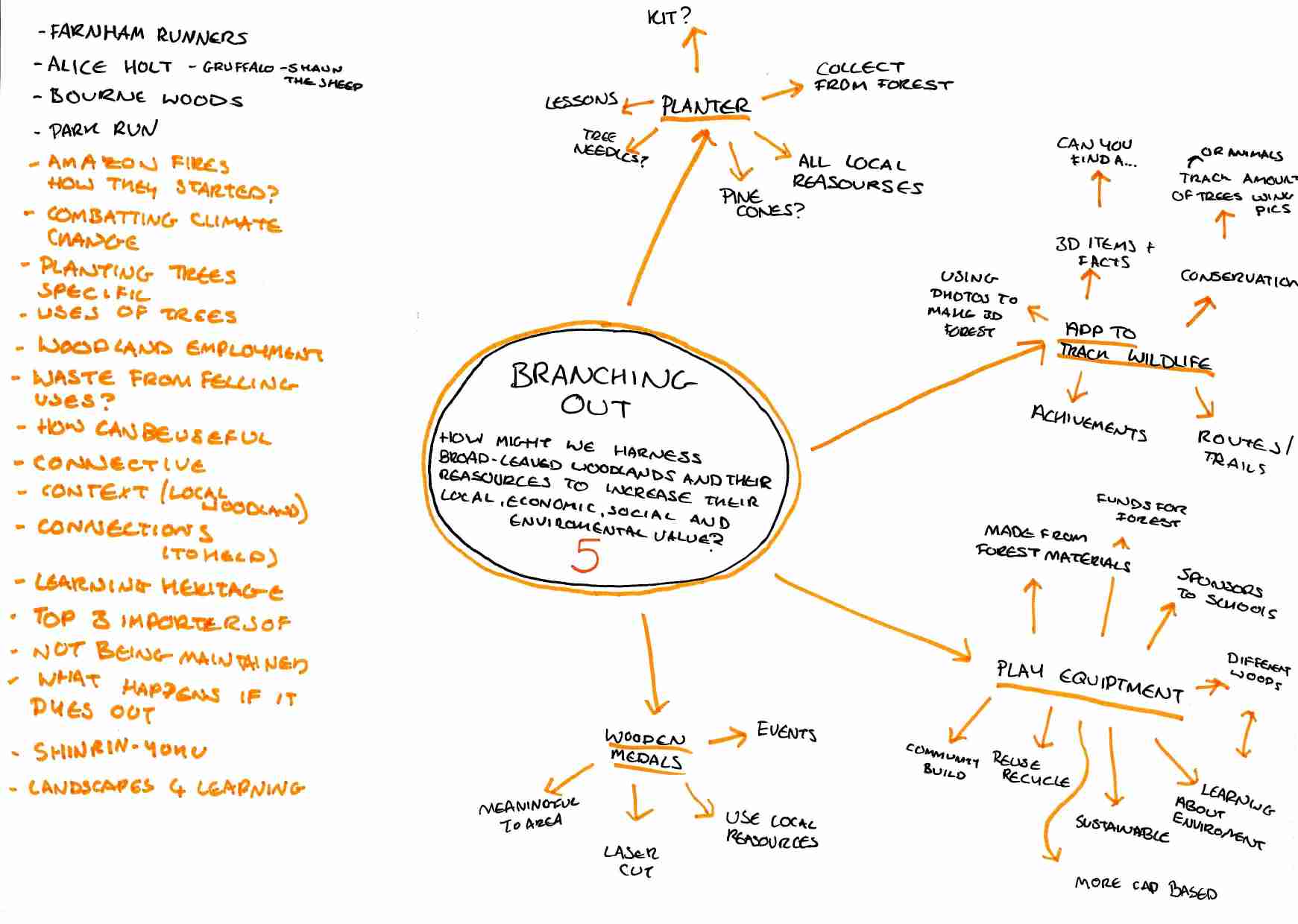
As you can see, I had many different ideas. My ideas spanned from a planter to an app to award medals. I ended up settling on play equipment. I chose play equipment because as I’ve grown up I’ve witnessed play parks become more and more boring. But not just that, they have also become a place that children don’t enjoy or want to visit as much as they used to.
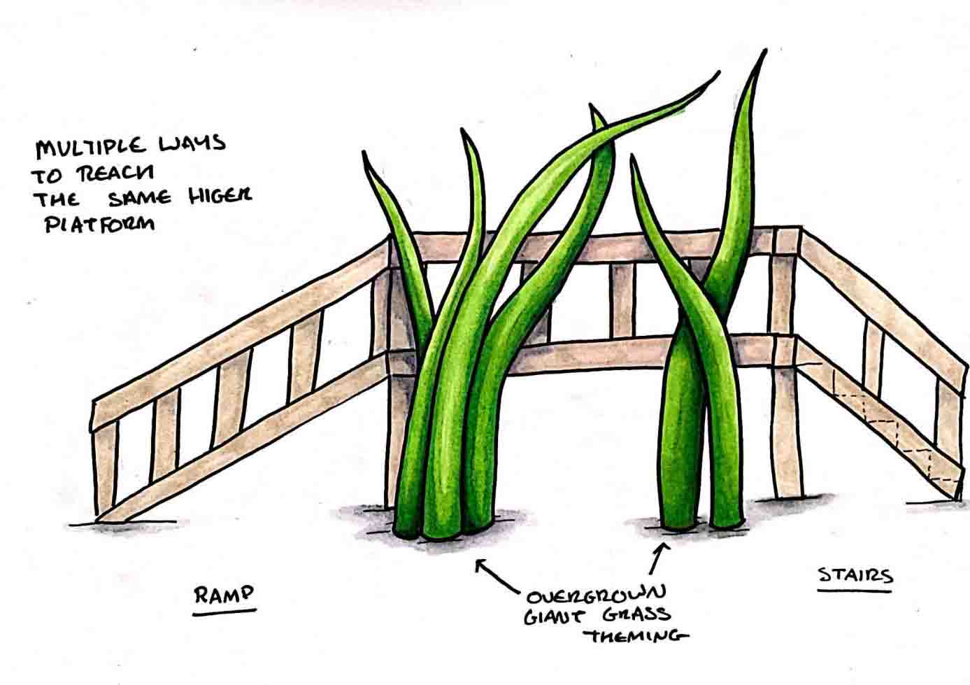
The play equipment I wanted to design wasn’t just normal play equipment. I want it to be sustainable as well as accessible. Designing play equipment that is accessible is a really important thing to me. My mum works in a school for children with a range of disabilities, anything from nonverbal to wheelchair-bound. At the school they have got play equipment,but only the able-bodied students can use it. There are a lot of parents that feel worried to take their children to parks because they don’t want their children to be bullied or stared at. My thought is, by making a complete increase of play area all children will play together and no one will be excluded.
The sustainability aspect links more in with the brief. Where it says “How might we harness broadleaf woodlands and the resources…?” To me means how can we use wooden resources responsibly.
To look more into both of these topics I needed to do a lot of research. As I ended up completing a lot of research, I decided to create a document using Adobe InDesign to show it all in a more organised way. It is possible to download the document using the window if you wish.
As I wrote on the last page, I took a few things from my research. These included what materials to use and what thought processes to include.
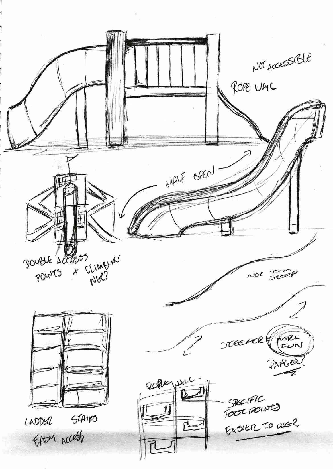
After doing my research I felt my next step would be to begin to sketch. Below are a few of my drawings. From left to right is oldest to newest, so you are able to see how my sketches gradually improved.
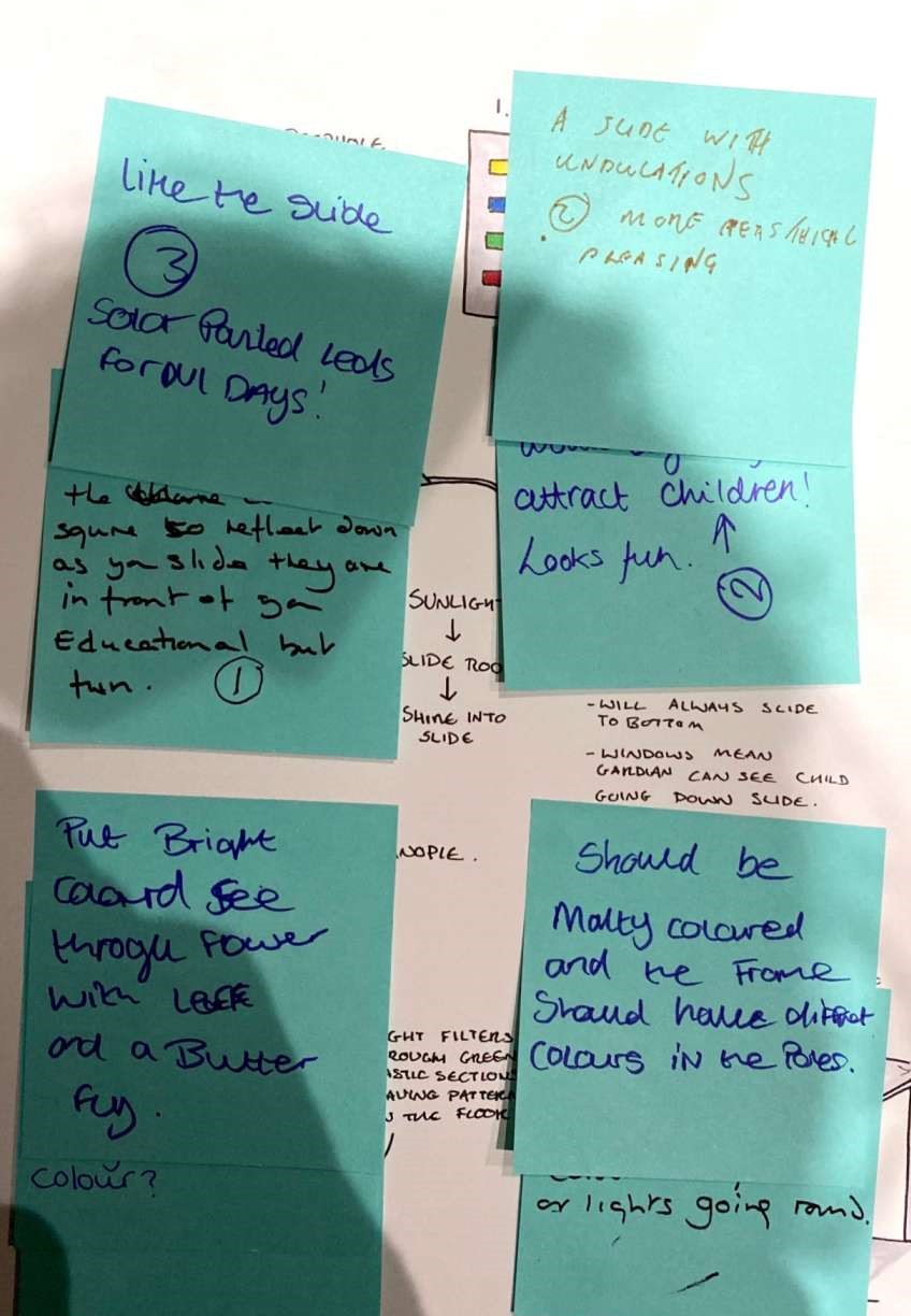
One thing that I did that I found very useful during this time was ask for feedback. I did this by walking around with Post-It notes and asking people what they thought of my drawings. How could I improve them etc. This was a very quick and easy way to get feedback and improve my drawings from it. Below shows one of my drawings covered in the Post-It notes
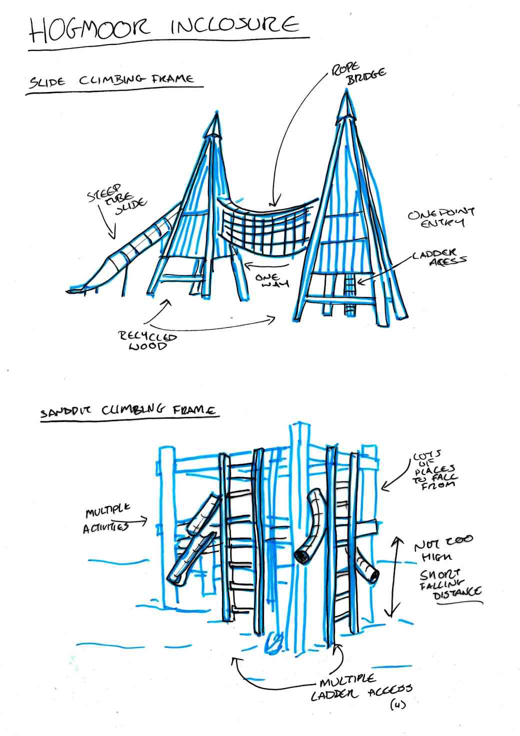
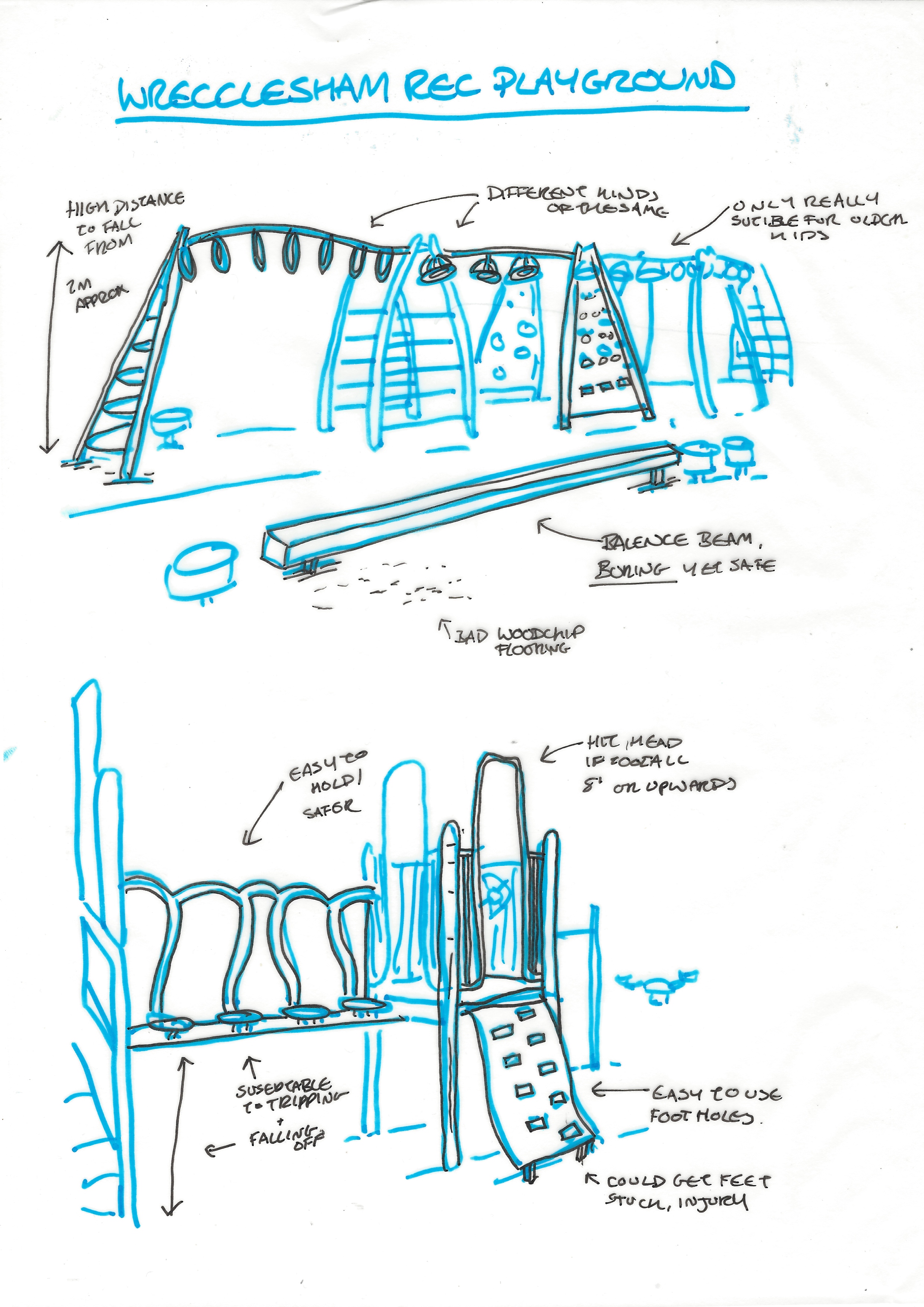
One other thing that I did to try to gage pros and cons as well as the shapes of the play equipment that I visited was draw it. I drew play equipment from the Hogmoor inclosure as well as Wrecclesham Rec, the best and the worst that I visited, to try to compare the two. Below are the drawings that I did.
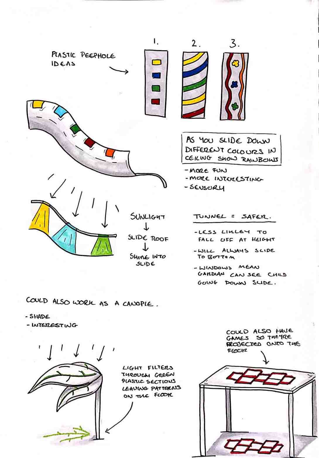
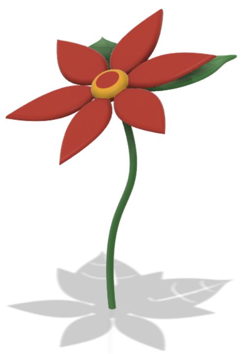
The first thing I attempted to make digitally was the slide. My slide design is my personal favourite out of everything I have designed for this project. The idea is, that when you slide down it the clear coloured panels above would shine different colours down for a multi-sensory experience. I took inspiration from water slides that do something very similar with lights to make it seem as if you are sliding through a jungle. But of course I wouldn’t be able to use lighting outdoors in all weathers, which is why I came up with the low-tech version of using recycled plastics instead.
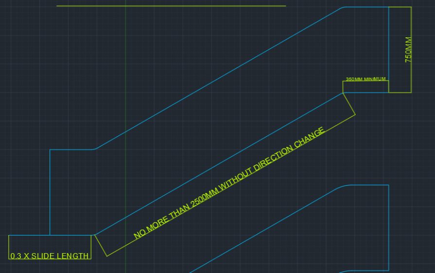
I created the slide as much to scale as I could, using measurements derived from the PIC & HAGS “An Essential Guide to EN 1176 and EN 1177” brochure. These measurements came from the pages describing minimum requirements for slides. Some of the requirements included:
Maximum length of a slide without change of direction, 2.5m The run out must be 0.3 times the length of the slide Tunnel slides are to have a diameter of 750mm
Below is a screenshot of the CAD drawing I created.
The next thing I did was take it into Fusion 360. I unfortunately did not record my process of creating the slide in fusion. It was a struggle to create, but what I did end up creating became the building blocks to make a small play equipment set.
As I began to continue building the main structure my screen recording managed to corrupt the second part. Below is the first part I was able to save.
As I managed to lose a large part of the screen recording I did a quick flick through the automatic recording that Fusion produces to show how I made the section that was lost.
After all of this I just continued to make pieces until I was happy. I used the extrude tool a lot, as well as the move and copy tool and the fillet tool. Below is the time lapse of the final part of the equipment creation.
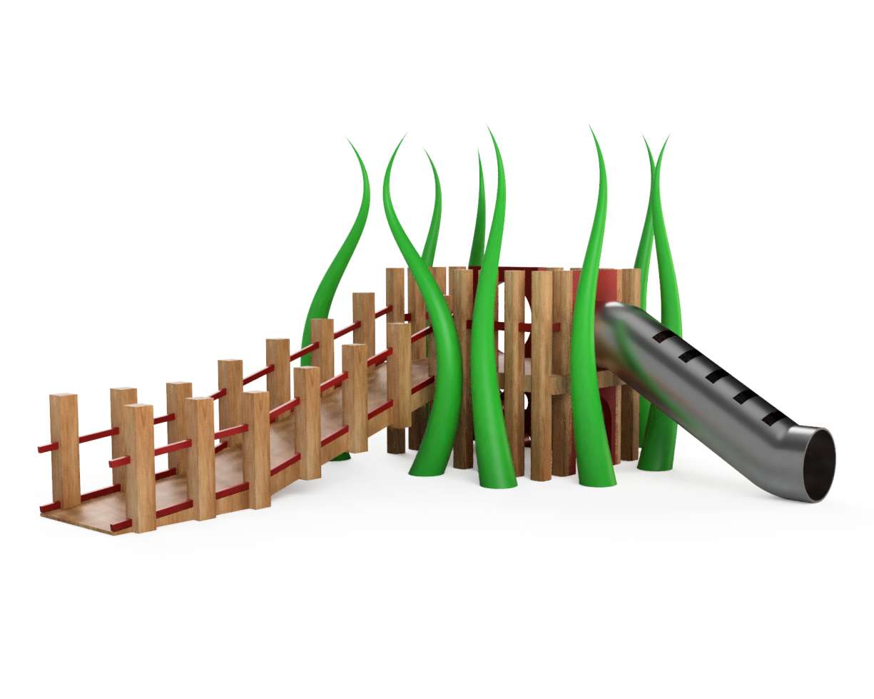
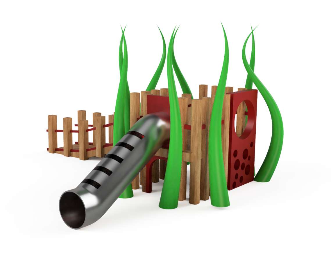
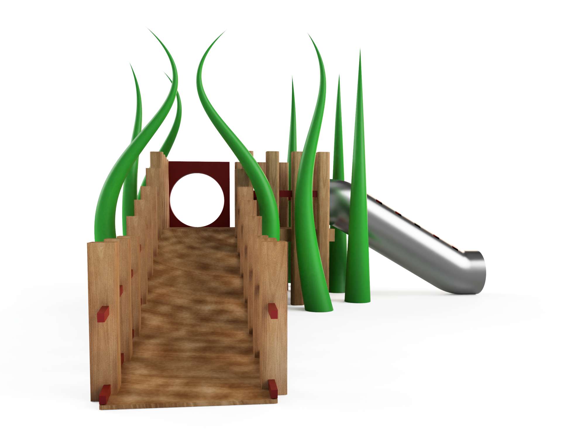
This is honestly the best model I have ever created in any 3D software. I really stretched myself to do the absolute best I could manage. The design manages to show the aspects I wanted to include, such as the hiding area and the double access points.
There is definitely room for improvement, but isn't there always? Im sure I will look at this model in a few months and think about all of the things I could do better, but for now I am proud of what I have created.
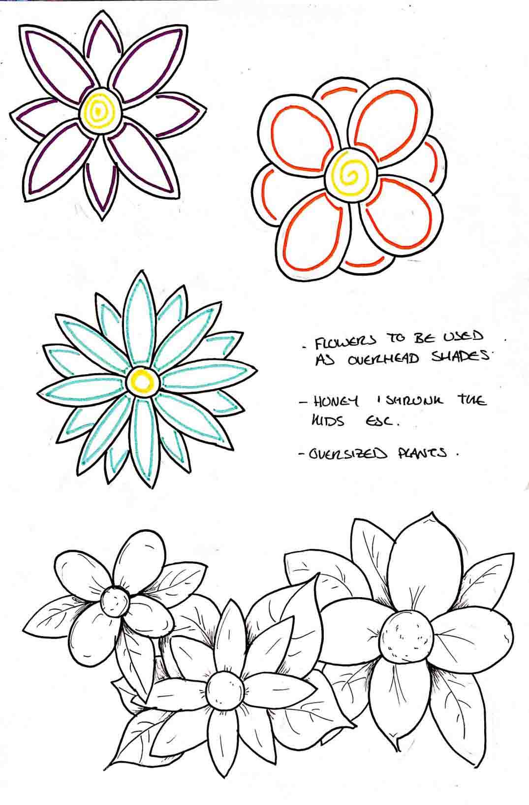
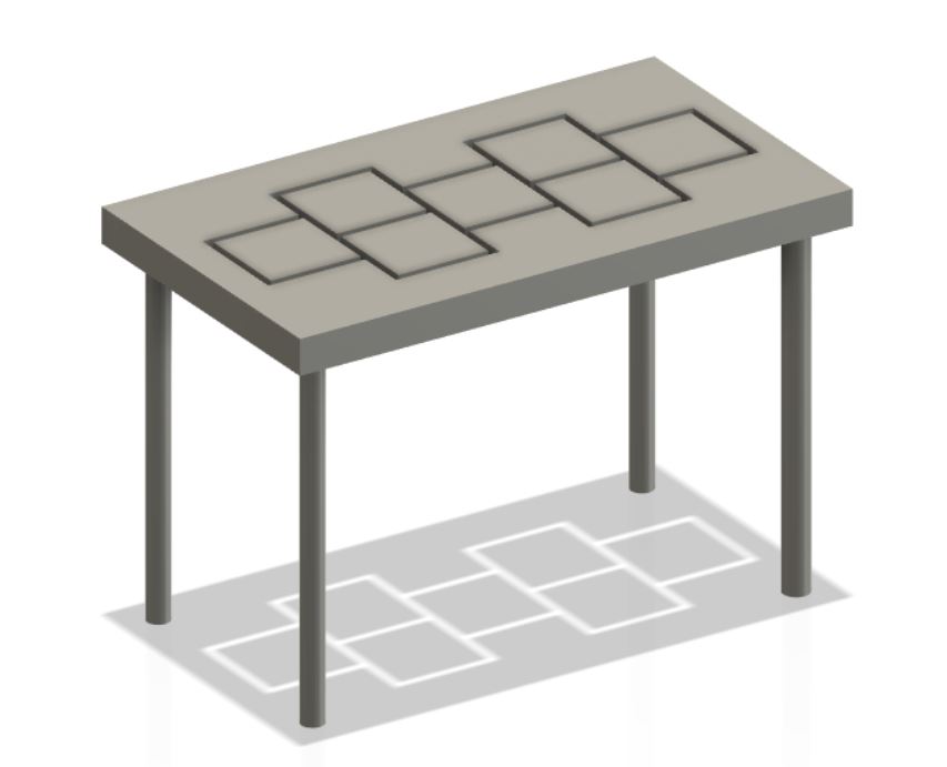
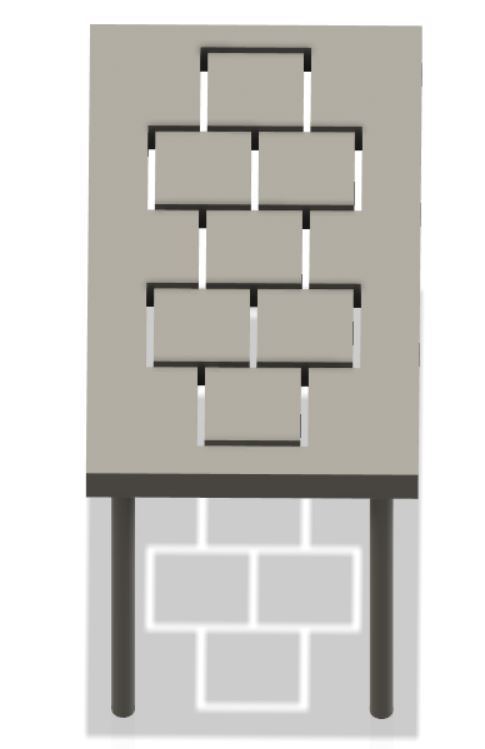
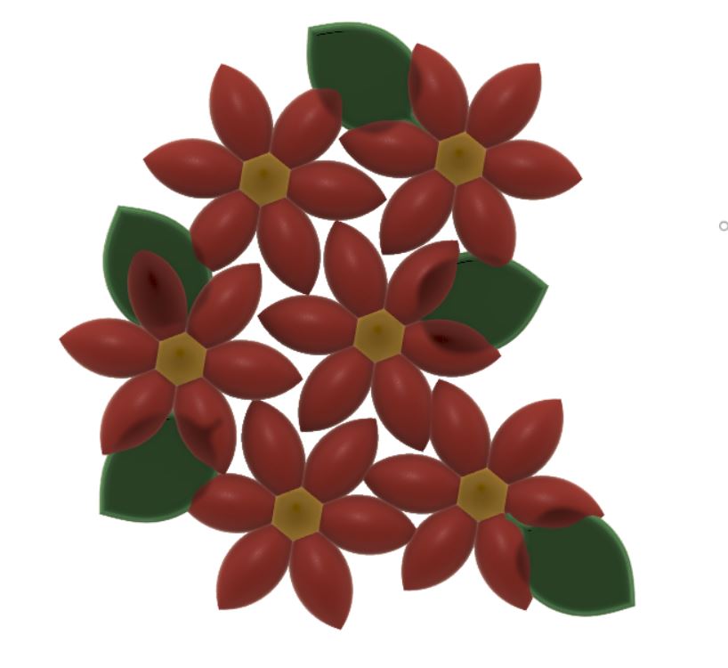
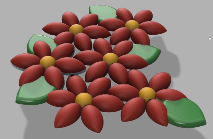
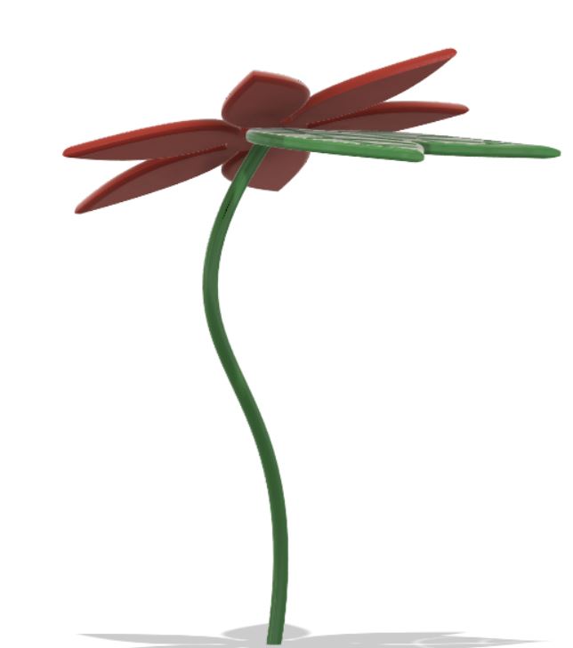
Aside from creating the main piece of equipment I also developed three different shade models. The large flower composition netting idea, the hopscotch idea and also a more simple idea derived from my leaf shade idea. I managed to screen record making each one of these models.
Out of the three I had the most issues with the simplest looking one, the hopscotch. I had a lot of issues with creating the cut out in the roof, but I managed to figure it out in the end. Below are all three of the videos as well as screenshots of the models.
Once everything was completed the last thing to do was make the RSA boards. They are done in the format for the RSA award so could potentially be submitted.
This year nine briefs were released. These briefs covered everything from moving pictures to being healthy. I chose brief number five, branching out. The brief description of number five is: How might we harness broad-leaved woodlands and their resources to increase their local economic social and environmental value?
I chose brief in five because it links heavily with the career path I want to take, landscape design.
To come up with an idea, I first created quite an extensive spider diagram. I originally created three spider diagrams, one for each of the Briefs I liked the idea of,But when it came to filling them out I was only able to actually write anything for branching out.
Below is an image of the spider diagram that I created.
As you can see, I had many different ideas. My ideas spanned from a planter to an app to award medals. I ended up settling on play equipment. I chose play equipment because as I’ve grown up I’ve witnessed play parks become more and more boring. But not just that, they have also become a place that children don’t enjoy or want to visit as much as they used to.
The play equipment I wanted to design wasn’t just normal play equipment. I want it to be sustainable as well as accessible. Designing play equipment that is accessible is a really important thing to me. My mum works in a school for children with a range of disabilities, anything from nonverbal to wheelchair-bound. At the school they have got play equipment,but only the able-bodied students can use it. There are a lot of parents that feel worried to take their children to parks because they don’t want their children to be bullied or stared at. My thought is, by making a complete increase of play area all children will play together and no one will be excluded.
The sustainability aspect links more in with the brief. Where it says “How might we harness broadleaf woodlands and the resources…?” To me means how can we use wooden resources responsibly.
To look more into both of these topics I needed to do a lot of research. As I ended up completing a lot of research, I decided to create a document using Adobe InDesign to show it all in a more organised way. It is possible to download the document using the window if you wish.
As I wrote on the last page, I took a few things from my research. These included what materials to use and what thought processes to include.
After doing my research I felt my next step would be to begin to sketch. Below are a few of my drawings. From left to right is oldest to newest, so you are able to see how my sketches gradually improved.
One other thing that I did to try to gage pros and cons as well as the shapes of the play equipment that I visited was draw it. I drew play equipment from the Hogmoor inclosure as well as Wrecclesham Rec, the best and the worst that I visited, to try to compare the two. Below are the drawings that I did.
I created the slide as much to scale as I could, using measurements derived from the PIC & HAGS “An Essential Guide to EN 1176 and EN 1177” brochure. These measurements came from the pages describing minimum requirements for slides. Some of the requirements included:
Maximum length of a slide without change of direction, 2.5m The run out must be 0.3 times the length of the slide Tunnel slides are to have a diameter of 750mm
Below is a screenshot of the CAD drawing I created.
The next thing I did was take it into Fusion 360. I unfortunately did not record my process of creating the slide in fusion. It was a struggle to create, but what I did end up creating became the building blocks to make a small play equipment set.
As I began to continue building the main structure my screen recording managed to corrupt the second part. Below is the first part I was able to save.
As I managed to lose a large part of the screen recording I did a quick flick through the automatic recording that Fusion produces to show how I made the section that was lost.
After all of this I just continued to make pieces until I was happy. I used the extrude tool a lot, as well as the move and copy tool and the fillet tool. Below is the time lapse of the final part of the equipment creation.
This is honestly the best model I have ever created in any 3D software. I really stretched myself to do the absolute best I could manage. The design manages to show the aspects I wanted to include, such as the hiding area and the double access points.
There is definitely room for improvement, but isn't there always? Im sure I will look at this model in a few months and think about all of the things I could do better, but for now I am proud of what I have created.
Aside from creating the main piece of equipment I also developed three different shade models. The large flower composition netting idea, the hopscotch idea and also a more simple idea derived from my leaf shade idea. I managed to screen record making each one of these models.
Out of the three I had the most issues with the simplest looking one, the hopscotch. I had a lot of issues with creating the cut out in the roof, but I managed to figure it out in the end. Below are all three of the videos as well as screenshots of the models.
Hopscotch shade
Multiple flowers shade
Single flower shade
Group Project
For this semester, we put ourselves into groups for a group project. My group consists of 3 three members. We decided to do the Transmedia 2020 branding project.
The Transmedia show is a show that the digital design area put on every year at the end of the second semester. It showcases the work that the digital design cohort creates to other students and potential employers.
My group and I wrote out all of the different sectors that needed to be completed, such as posters and flyers. Trying to find something relevant that I could do in CAD was a bit of a challenge, but we did manage to settle on a few ideas.
3D Glasses
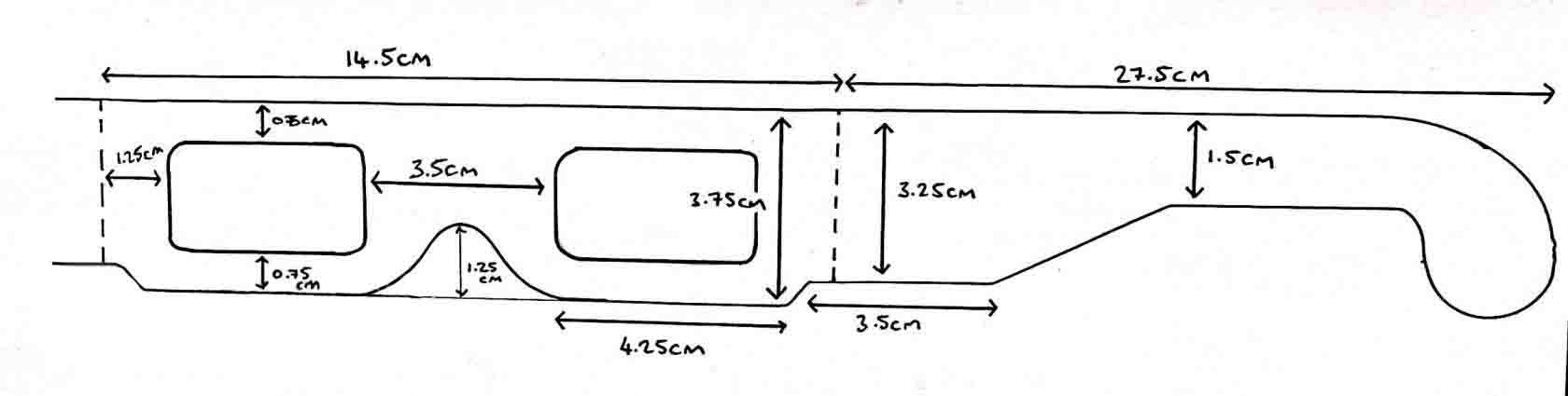
We thought that having 3D posters using the Anaglyph 3D technique would not only look interesting but could also be interactive and more fun. To go with the posters I designed Transmedia 2020 branded 3D glasses.
The first thing that I did was research. This included buying some very basic 3D glasses from eBay to look at measurements, see how they are assembled and assess the ergonomics of them.
When evaluating the main things that I realised where:
- The nose area needed to be slightly wider at the top as when wearing the glasses the card began to dig into the skin on my nose. By making it wider, it should remove this issue and fit better.
- The length of the glasses arms was perfect, but the angle was a little too abrupt. It needed to be smoothed out for a more comfortable fit.
Before doing anything on CAD, I sketched out a few ideas to show the class during a group presentation. I had really helpful responses from the class about my designs and decided to make two of them on CAD. Below are my original sketches.
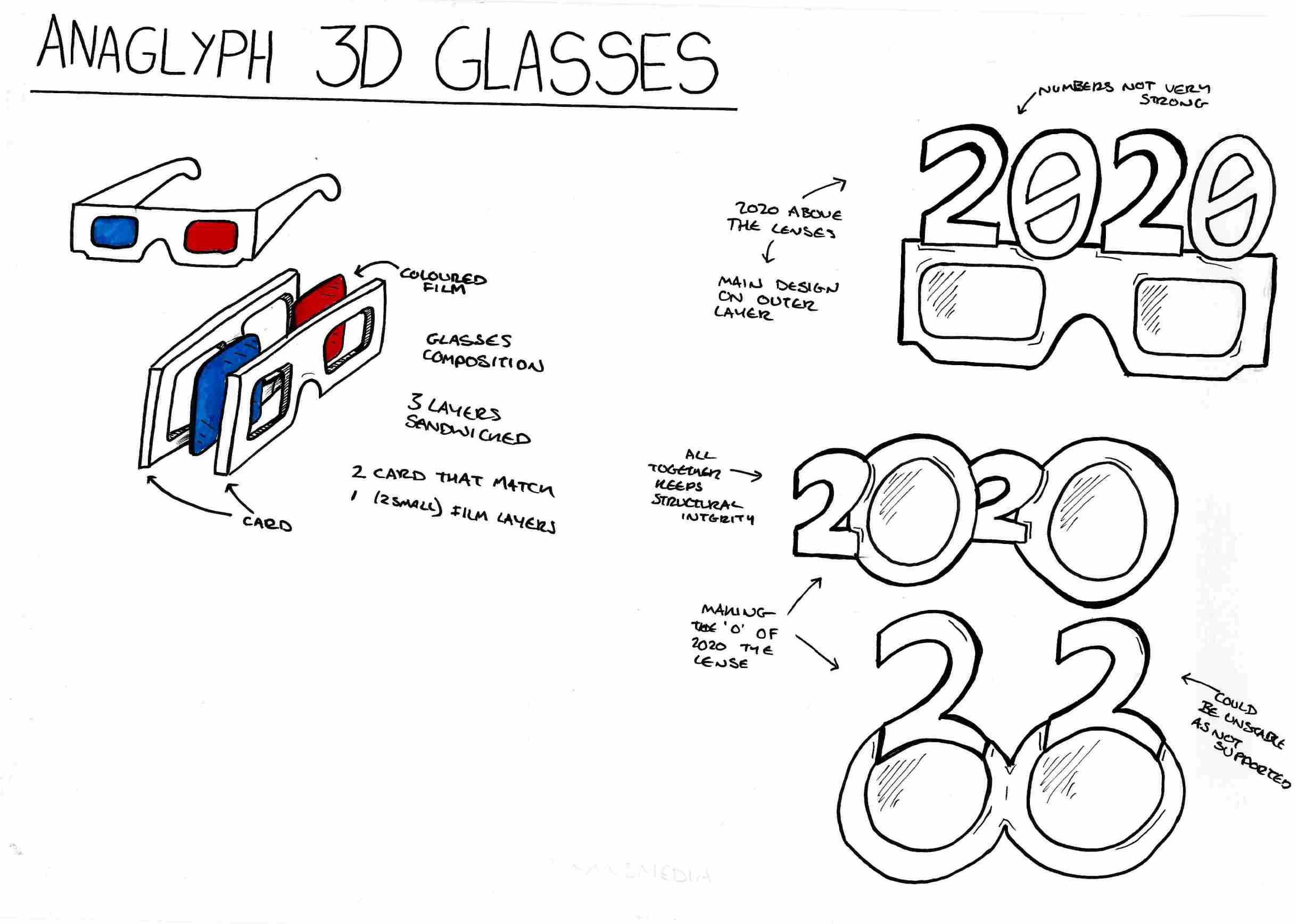
To make the 3D glasses using CAD I mainly used the spline tool. Although I did use the fillet tool to round the corners. I decided to make a few different versions to look at how I could include the branding within the design. I decided to record and timelapse my process as I feel viewing my process is more beneficial.
The glasses I’ve created on CAD are entirely to scale and could be plotted and used without any adjustments. Below is a PDF document containing the CAD layouts of the four different versions of glasses. It is also possible to download the document using the viewer.
Out of my final designs I really like the last one, V.4. I like it as it seems the easiest to wear yet it still shows the branding well. V.3 would be impractical as the front decoration has no support and may collapse when it’s being worn. It could be edited to create a support but I believe that it would end up being a little to top heavy and may become unstable and uncomfortable. With V.4. there is no need for any more support and as the weight of the design is evenly distributed it should be comfortable to wear.
To take this further I have spoken to lecturers and we have talked about potentially next semester laser cutting the glasses out of cardboard. We spoke about using cardboard rather than acrylic as using recycled cardboard would make the glasses more sustainable. A goal for CAD this year. Not only would it help to make the glasses more sustainable to make, but it would also make them cheaper and potentially sturdier to wear. These are both bonuses as if we were to make a large amount to distribute, it would cost less and they could be recycled after use.
Transmedia Logo
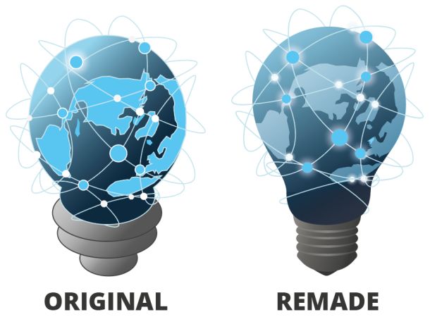
One of the designers from my group came up with the original logo idea from scratch. She imagined a lightbulb to resemble an idea, and then the world map on the outside of the bulb as the Transmedia is about showing the world and creating connections.
The original logo looked great but during a feedback session a few little changes were suggested. One was to make the shape a little more ‘lightbulb’ shaped and try to remove some black lines. I took it upon myself to recreate the original logo along with the new suggested guidelines.
I used Adobe illustrator to recreate the logo. My forte when it comes to design programs is still Adobe Illustrator as I have been using the program for almost 5 years now, and felt that using the program I feel strongest with would create the best result. Unusually, I didn't sketch any drawings before recreating the logo. I didn't draw any plans as I already had the original version to go off of, as well as a clear plan so believe sketching in this case to be irrelevant.
To create the new version of the logo I primarily used the pen tool alongside imagery from google. Although, a lot of the work that I ended up doing was adjusting the original logo pieces rather than remaking them. A it is not a new logo, but just a reimagined version of the original.
Below on the left is the original logo, and on the right my remade version.
To go one step further I decided to make the logo 3D. This was a much harder process than expected.
I used CAD to make the 3D logo. I used tools the revolve tool to make the 3D structure. I found this harder than any of the 2D designs as I am still relatively new to the 3D aspect of CAD. A lot of this process was me finding my feet in CAD and figuring out which tools worked the best.
Again as with the previous tasks I recorded and time lapse my process.
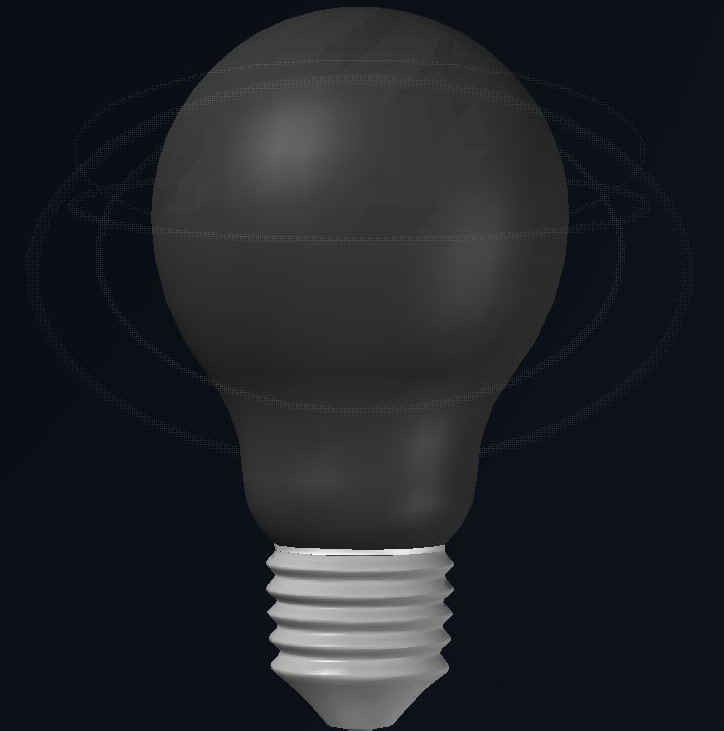
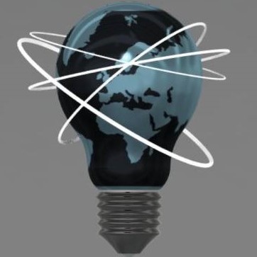
Unfortunately, when attempting to take some screenshots of the CAD lightbulb to put on my website, I discovered that the file had corrupted. It seems when I put the file into fusion it had stripped the CAD version of any colourings, so when I opened the file it was all grey. The image below on the left is how the lightbulb looks now. The image below on the right is how it looked before the file corrupted.

I continued, after making the bulb in CAD, to do the ambitious task of animating the model. This is another thing that I am new to. I attempted to animate my CAD model first but unfortunately it didn't go so well. Below are my two best attempts at animating the logo using CAD.
As the CAD versions did not look or go so well,I decided to try again. This time I decided to challenge myself even more so by using a new program. Fusion 360. I decided to use Fusion 360 as it is a program created with the sole purpose to make realistic models. By using fusion I felt as if it would add an extra layer of realism to the logo. I had only used this program once prior in class, thus I used many Youtube tutorials to make the Fusion model.
Unfortunately I wasn’t able to record myself making and animating the model in fusion. But luckily, the whole process was fairly easy. I was able to import my 3D model from CAD which helped straight away, but when the model was imported it lost all of its image mapping so became just a gray model. I had to figure out a new way to make the map span across the lightbulb globe. To do this I created a new appearance with the name ‘Map’. I then applied this appearance to the model. Once it was applied I right clicked to edit the appearance to make the map on the lightbulb have the correct positioning. This took a lot of editing but I think that the end product looks really good.

To create the animation using fusion was a struggle. I animated the lightbulb before we were shown how to do so in class so YouTube tutorials where a great help. Below are the two animations I created of the lightbulb.
I am really proud of the animated model I've created. It really was a challenge for me to get my head around the task, but I’ve done it well and that's all that matters. Creating and animating the logo has encouraged me to use Fusion to create more 3D models in the future.
 Block Attribute Data
<
Block Attribute Data
BIM is Building Information Modeling. It is used in many building projects to ensure an industry standard for materials. It is beginning to be rolled out across the world and is a very useful skill to learn.
For this task we were asked to create a simple 2D design and add BIM attributes to it. I decided to make a very simple, not to scale, screw top. It took me a little while to get my head around the attributes, but, I think I did alright in the end.
I ended up adding 3 attributes:
Below is the PDF of my work, as well as a download link for the .dwg file.
Download the CAD file.
For this task we were asked to create a simple 2D design and add BIM attributes to it. I decided to make a very simple, not to scale, screw top. It took me a little while to get my head around the attributes, but, I think I did alright in the end.
I ended up adding 3 attributes:
- Item name
- Date
- Author
Below is the PDF of my work, as well as a download link for the .dwg file.
Download the CAD file.
 Geometric Shape Evolvement
<
Geometric Shape Evolvement
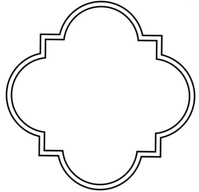
We were given the task of creating some kind of model using only a 2D image as a base. This was the first time I had made anything in Fusion without an instruction manual so it is not the most adventurous model out there.
I simply extruded the shape given, once to make a table stand and a second time to make the table top. I also applied a wood appearance to the table. Below to the left is the shape we were given to start with. To the right is my simple table model.
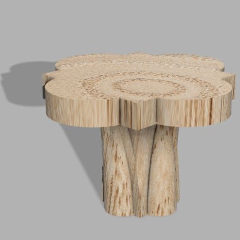
We were also asked to lay out the table on a layout template showing the different views. Below is my rendition.
I simply extruded the shape given, once to make a table stand and a second time to make the table top. I also applied a wood appearance to the table. Below to the left is the shape we were given to start with. To the right is my simple table model.
We were also asked to lay out the table on a layout template showing the different views. Below is my rendition.
 Animation
<