YEAR 2, SEMESTER 2
Social Media Project
Hover over an image to enlarge it.
Brief
At the start of the second semester we were given the task of beginning our own social media campaign. This campaign would begin the week after half term (24th of February) and run for six weeks until the first week of April. The topic of the campaign could be anything, but promoting our website portfolios was given as an example. The original aim was to gather as much traffic as possible to our portfolio websites by using the social media platforms to promote them. As you’ll read later, I gave up on that idea.The Idea
When we were originally given the brief, I had lots of ideas. From animals to gaming, originally I really didn’t want to focus on myself as I felt that I didn't have much to show; but then it dawned on me. This is the perfect opportunity to promote myself as a brand.Ideally, one day I would like to be a freelance garden designer. I’m not sure which aspect of garden design yet. My favourite aspects are private garden design and indoor garden design. I also really enjoy aquascaping and designing fish tanks which also leans really nicely into plants and widens my demographic.
So why not post my journey into learning more about plants? Letting people in on how I care for the plants I own, how I come up with plant based design ideas. It could be the beginning of my garden design brand, showing who I am as a designer as well as a plant and aquarium owner.

Timing
Before any kind of design work was done, I needed to figure out the timings of the project. Over a 12 week period, I sorted out when I was planning to finish particular aspects so that the project could flow. To do this, I used a Gantt chart.Gantt charts are visual ways to map tasks against the amount of time they need to be completed. My Gantt chart separates nine different tasks into the time durations I planned to complete them in. Some Gantt charts use colours to who is meant to be completing the tasks. As I am the only person working on this project, my Gantt chart uses different colours to make it easier to separate the tasks. This allowed me to roughly map out when I needed specific tasks to be finished by in order to keep on track.
Platform research
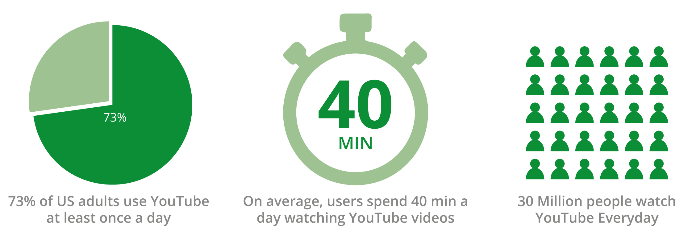
To have a social media campaign, you need to know what social media platforms are the best for your brand. There is no point posting your brand on a completely unrelated platform. For example, Tiktok is primarily a platform for younger people so there would be no point advertising a care home there.The two platforms I wanted to look into were Youtube and Instagram. I already know a lot about these two platforms from a consumer perspective as they are my two most frequented platforms. As they are my most frequented platforms I felt them to be a good place to start.
As instagram is a photo based application I thought it most appropriate to use. It gives me a way of showing an audience rather than primarily talking to them. Instagram works on aethstetic. If someone likes how the photo looks, they'll follow you and begin to look at your other photos that also apeel. If you don’t post the right photos, you wont get an audience. You can't get an audience on instagram by talking. This all relates well to my brand. My brand is about showing people about plants. You can’t talk about the leaves on a plant without being able to see them.
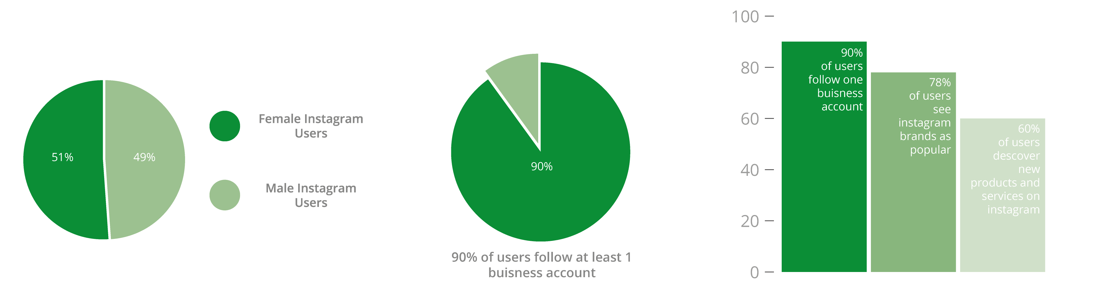
My idea demographic is pretty much everyone over the age of 16, male and female. So I decided to do a little research into what kinds of people use instagram as a way to understand the platform a little better as a business. I also decided to create some small infographic charts to demonstrate the statistics.
I also wanted to research a little into what makes a page successful. A friend of mine runs a large K-Pop editing instagram page. Below is one of her popular posts.
I conducted a small interview with her about her page to figure out if there are any trends that she has noticed that may follow through to my demographic.
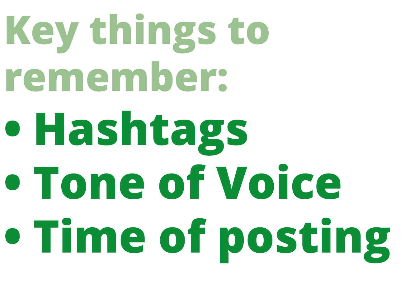
The interview was really helpful. She reminded me that hashtags are useful and that timing is essential. She didn't only allow me to interview her, she also gave me a screenshot of her insights on instagram to have a look at and see what the insites are like for a large page.
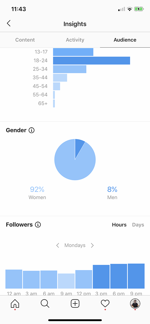
Her insights show me that her market is mainly 18-24 year old females. This is no use to me unfortunately, but the times of posting at the bottom is.
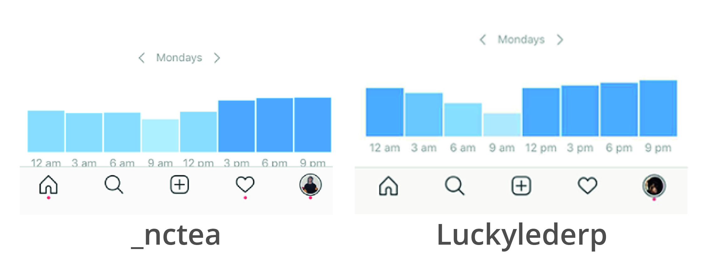
If I compare this to an old account that I use to run with a lot less followers (only 159 in total) you can see that between 3pm and 9pm there is a rise in activity. The two accounts are completely different. One being a dog account with only 159 followers and the other being a K-Pop account with 18.9k followers. Yet, the active follower times are the same. According to this little experiment, 3pm-9pm on a Monday is definitely a good time to post.
Youtube
I wanted to use Instagram as my primary platform and YouTube as my secondary. The main reason I wanted YouTube to be my secondary platform is how easy it is to create content. You can get a photo for instagram any time. YouTube videos need to be filmed and edited which takes a lot more time. I can pour out instagram content daily, whereas to make a youtube video you need a topic to be filmed, time for the editing and potentially voice overs. It's not practical to make this my main platform.Although I don’t want YouTube to be my main platform, it is still important. I did a little bit of research on facts and figures to figure out how important. Just like with the instagram information, I’ve made a few infographics to demonstrate the statistics.
Unfortunately, I don't know anyone with a large YouTube following so I was unable to look at first hand statistics like I did with instagram. Instead, I looked at a few different videos to try to gather tips and tricks on how to produce good videos and grow a YouTube channel.
One video I watched was by Pewdiepie, the second biggest YouTube channel in the world. As his content is different to what I might end up creating (nothing about plants!) I had to take his advice with a pinch of salt. He has been through it all, so a lot of what he says has come from his experiences.
The next video I watched was by a channel called Video Influencers. This video is very different from Pewdiepies. They make a good point about learning from your mistakes and figuring out what works for you.
I learnt a lot from both of these videos, and the others I haven't mentioned. It was nice to be able to see two completely different outlooks on YouTube and how it works. These are the key points I found from watching these videos:
I also looked into a few different videos that are similar to ones I ended up creating. I created this document after I created the YouTube video that I talk about nearer the bottom of the page.
Branding
Of course, before I can begin to make posts I need a brand. I've already decided that I will be the brand, my journey learning about different kinds of plants. A brand is more than what you post.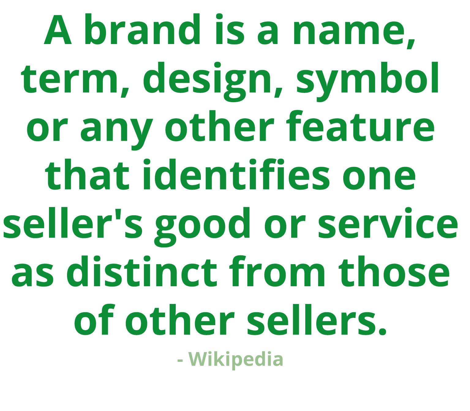
Name
The most important part of a brand is its name. Names can easily become forgetful if its not different. You need to choose something that is unusual, but not too complicated so that your audience will remember you.Originally I thought I would use ‘AJTG’, my initials, as it's what I have been using for other aspects of my work. It is the logo on my portfolio website so it seemed the easy option. My main issue with using my initials is that they are a bit of a mouthful. AJTG isn't easy to remember, nor does it flow well. Also if you google AJTG, it comes up with all sorts of random and inappropriate things. So AJTG was scrapped.
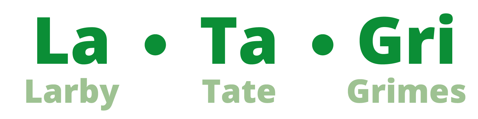
It was my Dad that came up with my final decision. Latagri Design. Latagri is the name of my home. When my family moved into our house 21 years ago they combined the surnames from three generations - Larby, Tate and Grimes - to create Latagri House. Latagri does not only mean something to me, it is unusual. It’s a word that could stick in people's minds - it's memorable.
Logo
Once I decided on Latagri Design as my brand name, I needed a logo.I didn't know where to start with the logo design originally. To begin I made a moodboard. I really like the look of simplistic block colour logos. Both with and without text. I especially like the way that Aaron Draplin makes logos. His designs look both retro and modern at once due to his bold colour choices paired with older style text. I also really like the way he barely uses black outlines and relies on the colours to create the separation. Below is the mood board I made, Aaron Draplins work is in the bottom right corner.
After the mood board was created I began to create a few thumbnail sketches in my notebook. I needed to decide whether the logo would be text based, image based or a combination logo. Originally I thought that linking my logo to plants would work well. It turns out that banana leaves are hard to draw!

Once my thumbnail sketches were complete I decided to begin experimenting on Adobe illustrator. Illustrator is my go to when creating any kind of graphics as it's easy to produce multiple versions. Below is the first experimental board I created.
I started off with the previous banana leaf logo idea, and then I looked into creating Calathea leaves into a logo. (the pink and dark green logos). I do like the way they turned out, but I don’t think that they suit the brand that I am trying to create.
After trying to create only image-based logos so far, I decided to have a go at creating text based ones. I really like the look of retro logo fonts, specifically the Atari logo font. I like how smooth the font is. It is minimalistic and easy to read. The curves of the letters give it a more complicated look, yet it is still simplistic.
I went on to a font website, to attempt to find the Atari font. What I ended up doing was finding similar versions and writing Latagri using the web-based font generator. This allowed me to see what the name would look like in the font without having to download loads of fonts that I wasn’t going to use. I ended up creating a matchup of my favorites. I then used the line tool in illustrator to re-create this matchup font into a version that I could manipulate and make my own.
As much as I like the text, I know it needed something more to make it into a logo. Now came the main part of my logo experimentation. I began with just experimenting with the text. I kept the logo in black-and-white and looked at different lines and fonts for the design section of the logo. I then moved on to the colours.
The colour choice of a brand is just as important as its name and its logo. For instance, if you think of IKEA you know that its main colours are blue and yellow. It’s iconic.
Again this was just a process of experimentation. The boards that I have inserted below are the organised version of my original boards which were all over the place.
I started off with my favourite colours, yellows and oranges combined and pinks and purples combined. I do really love the radiant look for the orange and yellow. I realised when the logo is downsized it just looks like one colour and that the bottom half Latagri is missing. So the gradient was scrapped.
I then attempted to look at different ways to display design text rather than it just being underneath. I like the orange version with the design against the I. The only issue is, again when it is downsized you can’t read the design text properly. So once more, this idea was scrapped.
This is when I decided to take a completely different approach. A lot of the logos I looked at when creating my moodboard were circular, so I attempted to make Latagri the same. I also looked at creating a leaf shape, but it ended up looking more like a teardrop. When I asked people what they thought of the leaf one, not one person could correctly identify what it was. So I scrapped the leaf idea as well.
The circular target like logo really appealed to me. As you can see I attempted to make it just circular without the target aspect, I also tried to use gradients but I kept coming back to the original block coloured versions. I used the thick black outline around the original ones to mimic Aaron Draplins style. It looks good, but when shrunk it bleeds into the collar and makes it look dark and unreadable. This is when I attempted with the white text. The white text makes it lighter and easier to read.
At this point the only issue I had was with the colour. When I showed friends the three different colourings, orange green and blue, I had mixed results. Everyone agreed that the orange version of the logo looked too much like the Nurofen logo - so I gave up with that colour idea.
I ended up deciding on the green logo with the white text. The main reason being when you think about plants you think green. It’s easy to look at and pleasing to the eye with the gentle blocky gradient of the green colours. Matched with the Atari styled text, it looks a little bit retro but also quite modern. Below is the official Latagri design logo.
I also created a 3D version of the logo. I created it with the intention of using it as a thumbnail for videos. Unfortunatly, I never ended using it as I couldn't figure out how to put the logo into any videos. Below is the video of me creating the logo using Fusion 360, and a render of the final product.
Website Idea
As you will read on this page, my website didn't go as planned, but I still designed one. Below are my original sketches for the website design that didnt come to fruition.
Brand Guidelines
All brands need brand guidelines. Brand guidelines are a summary of how the brand should be presented. A brand guideline document can be used within a company and externally to make sure the brand is always presented consistently. It contains things such as the tone of voice to be used, its colour scheme and its logo.Below is a PDF of the Latagri design brand guidelines.
Action plan
Before we could begin the social media campaign, we needed a plan. We were asked to submit an action plan by week six. The kind of action plan that I created wasn’t static. I created a live action plan as I felt that it worked better with my project. By live action plan I mean it began as a blank document with placeholders for posts, but as the weeks went on I filled in gradually what I plan to do in the coming week. This meant that what I was posting was becoming more accurate and appropriate the more I learnt about trends.Below is my filled out action plan with all the details from the launch week to the last week of posting. (Six weeks) I decided to start a week earlier during half term as I had a few trips planned that I will talk about later.
Some of the other things I included on this action plan were how I felt the post was doing and my immediate reactions to it. This was to help me when I write my reflective report as something I find quite difficult is recounting how I felt at the time.
Posts
To actually be able to run a social media account, I needed content.Near the beginning of the semester we had a guest lecturer come in to class. She runs social media campaigns for multiple types of different companies. She spoke to us about different types of content including created content and curated content. We also looked at SMART goals.
SMART goals stands for specific, measurable, attainable, relevant, time bound. It’s a way to set goals that are actually attainable. If you look back at my action plan I have goals spread throughout the week. For example I am going to share an image and I aim to get 15 likes and five followers from the image.
The most important thing she spoke about in my opinion was about types of content.
Created content is videos and images that you have created yourself to post. This could be a photo that you took, a drawing that you came up with the video you captured.
Curated content is content that you didn’t create. For example you shared an interesting image from another page or took part in a photo challenge that somebody else came up with.
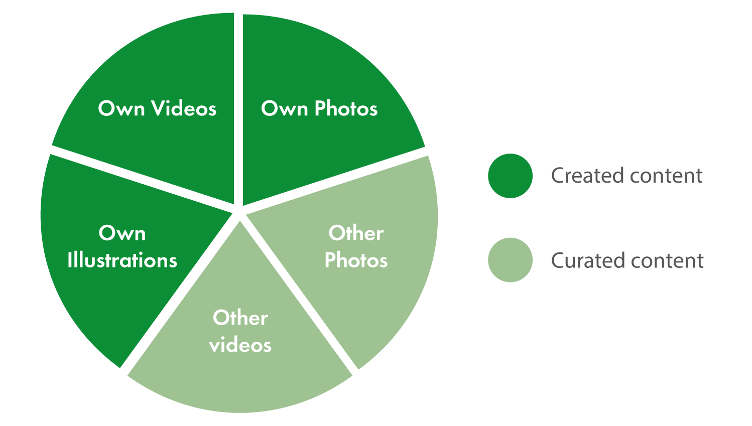
She helped us understand that a good social media campaign will have a mix of both. For my page I wanted to aim to have 60% created content and 40% curated content. As you can see in the pie chart below my created content includes photos, videos and illustrations that I have created. My curated content includes other pages photos shared on my Instagram story and other content taken from similar pages and shared to my story and my timeline.
This mix of curated and created content means that there is a little bit of influence from other pages mixed in with my own to create a slightly more interesting page dynamic.
Content creation
Before I could begin the actual campaign I needed to create some content. A large portion of my content I wanted to create later in the process, but to begin I need to see some photos with the plants I have at home.I looked into a few similar Instagram pages to gather some ideas for how to take my pre-prepared photos. Below are two different accounts that post plant images similar to what I want to do.


Something I noticed about the images from the two accounts is that they have a theme. ‘Theplantmammamia’s photos are all bright and minimalist. They show the plants usually on a white background which highlights what you are meant to look at. It also means that they are rather eye catching as they’re so bright.


Ps.Plants photos have a similar theme, minimalist and bright, but her photos are a lot more artistic. They have close ups and raindrops to make the images a little more interesting.
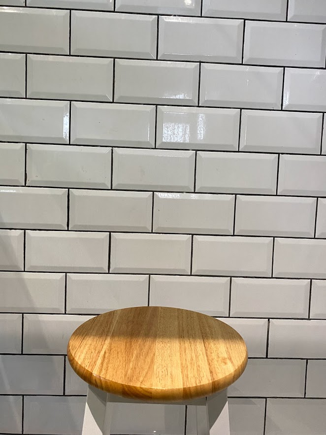
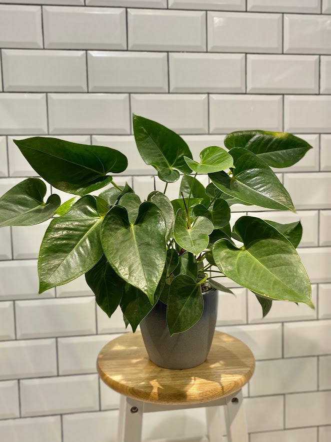
I ended up buying a wooden stool and putting said stool into my shower to take photos of plants against the tiled background. I took them in my bathroom against the tiled background as it meant that I had a bit of a theme going on.I ended up taking about 30 different photos of nine different plants using this method. Below are two images I didn’t end up posting, one of the stool without any plants and another of an Anthrithm that I just ended up not posting.
Of course, I only have a limited selection of plants at home so I took the decision to visit a few RHS gardens to gather some different and interesting photos. I ended up visiting Kew Gardens and Wisley Gardens.


All of the photos that I took I attempted to keep with the general theme. This general theme was that the plant I was taking a photo of was central in the image. The plant would either be sitting central or I would be holding it up. This was pleasing to the eye as it uses the third rule but it also meant that the plant I was talking about was obvious and easy to identify.
A lot of the content I created I did whilst the campaign was ongoing. For instance as well as taking photos at the gardens for future posts, I also posted images and stories whilst I was there to utilise tagging their own larger Instagram pages. This also meant that I could use location relative hashtags, such as #london and #thames, whilst in Kew which have a larger audience.
Posted content
Below I have embedded a few posts from my Instagram page. You can see a few different images that I posted as well as the IGTV video and some pinned stories. Unfortunately I am unable to embed my entire Instagram page but, if you click the view profile button in the top right you’ll be up to see my entire profile.Results
This social media campaign went a lot differently than I was expecting. I was expecting it to be a little more difficult than it turned out to be. I ended up getting into a bit of a rhythm especially at the beginning where I would post and then spend about an hour liking other people’s posts to entice them to like my page. After doing this for six weeks I ended up racking up 130 followers, which is double the amount I was expecting to get!A lot of the data that I’ve collected from the campaign has unfortunately been limited to the first four and a bit weeks. This was due to the Covid-19 outbreak where regrettably my social media campaign was pushed to the end of my to-do list. Even though the last two weeks are a little bit lacklustre, I still have a lot of data from the first four and a bit.
Likes vs Follow graph
I created a graph to show the correlation between post likes and follower increases. I made the graph as it’s an easy way to visualise how post likes and followers relate to one another.For example, post number 9 and post number 14both had jumps in the follower count. They were also two of the most liked photos that I posted. You can see this trend again if you look at Post number 17. Post 17 had one of the lowest amount of likes, the amount of followers only grew by four after that post whereas after post number 14 the amount of followers increased by 10. Likes really do make a difference the amount of followers gained that day.
Screenshots
At the end of each week, I attempted to take screenshots of the activity section in Instagram insights. This allowed me to see which days of the week had the most activity as well as how many accounts I reached and how many times my profile has been visited. I successfully managed to take screenshots for the first four weeks of the campaign. You are able to see the four weeks of screenshots put together below.


One thing you can notice straightaway is that Wednesdays and Fridays are the best days for activity. Which is why throughout my time of posting I attempted to post every single Wednesday in order for my posts to be successful.
Below you can see another graph showing post likes only. Each colour represents a different day. As I’ve previously mentioned Wednesdays are a good day for engagement. You can clearly see that on the graph. Wednesdays are represented using pink. The pink bars overall are the tallest meaning that the post on a Wednesday had the most likes.
Something I find quite interesting when looking at this graph is how consistent the green and the orange bars are. The green bars represent Tuesdays and the orange bars represent Monday’s. The engagement screenshots also show that Mondays and Tuesdays have consistent activity but just a lower amount of it.
Trends
According to the previous graph the three top posts were number 9, number 13 and number 14. These posts are all embedded below.These three posts are considered to be the best photos on the. They all have something in common. They are not just a picture of a plant. Post number nine for instance. It is a photo of a bromeliad, but the bromeliad is floating in a triangular terrarium. You don’t see that every day, it doesn’t blend into your feed it sticks out. This is similar to Post number 14. Number 14 is a photo of one of the Kew Gardens greenhouses. This one is impressive because you can see the metalwork of the greenhouse surrounding the greenery. Again, it is not something you see every single day it sticks out on your home feed.
Post number 13 is a little bit different. Instead of being impressive by being something you don’t see everyday, it is impressive because of the colour. The bright pink flowers again help the image to stick out on your timeline. It’s pretty, people like pretty things.
One of my least liked posts happens to be the one I spent the most time on. This post is an IG TV video of the Aqua Scape of one of my fish tanks. Generally this is impressive as people seem to respond to it while in image form (see post number 21 with 48 likes). I made this video without taking into account some of the items that I had evaluated previously when I looked at YouTube videos. For instance, I made the mistake of making the introduction too long. The introduction is where you draw people in to watch a video, the first few seconds of the video is just a photo of my logo. This is boring.
Another thing that I did wrong was use a dark thumbnail image. This meant that when people were scrolling past the video it was eye-catching, not something that you’d want to stop and watch. Another thing that I did which jeopardised the success of the video was I posted it at a bad time. Thinking back I rushed into posting it as I was happy with the outcome. I should have waited two days into Wednesday and posted around midday where I had the most interaction. Even though the instruction was too long and the thumbnail was not right I still would have gained more interaction than I did in the early hours of Monday morning.
When I started the campaign I used the link at the top of my Instagram page to promote my portfolio website. I got little to no traction with this so when I posted the IG TV video I swapped the link to a link to the video on YouTube. I was also able to use the 'Swipe Up' function on my instagram story to the link. This did help my video gain a little bit of action. I ended up getting 15 views and 3 likes. Originally I wanted to do more on YouTube but it was so time-consuming I couldn’t find the time and a topic to build a video about.
I also regularly used the story function on Instagram. I tried to with every post to promote the image on my story. This was incase my followers hadn’t noticed the post yet so they would be able to go directly to it from my story. I also used place and time tags when out. This meant that my stories would also appear on that place stoey. This allowed people who werent following me and just looking at location stories to find my account.
Another thing I tried to do was go on to hashtags used on my posts and find an image from another user and promote it using my story. Using this tactic, I end up finding an account who worked with me a little bit towards the end of the campaign. She would promote my images and I would promote hers. This allowed me to get a little bit of traction in other countries as her account is based in Switzerland. More often than not, the accounts I promoted in this way ended up following my account.
Below you can see a few screenshots of what I posted on my story, including a location post and a new post insicator.


The stories worked suprisingly well at times. If I posted them too late or too early in the day it would get little traction. The sweet spot was around midday when people where on lunch breaks etc. This is when my stories got the most interaction.
The Website
As previously mentioned I gave up on my website. At the begining I created a basic portfolio website containing just contact details. I used my current portfolio website as a template and just changed the logo and colourings. I then temporatily uploaded this to the University server along with my normal portfolio website. I linked it with Google analytics to see what interaction it would get. After I launched it I got 2 views. It didnt look great and was a bit of a failure. Especially as I'm pretty sure those two views where myself viewing it. Below you can see a image of the website and the analytics.


After this first website disaster I decided to use a website building site to build a better website. I tried Wickes and a few other big name website builders but none of them would allow the use of analytics without a paid subscription. I ended up using GoDaddy to create a website as I could try out the analytics. In three weeks I got a grand total of 6 users. Unfortunately I forgot to take screenshots at the time of creating the website so I only have this one image as I am unable to access the website unless I pay. Thats when I decided to swap my link on instagram from my website to the YouTube video in the hope that the few people that would view the link would leave a like on my Video.

Conclusion
I’ve concluded a few things after experiencing the social media campaign. The first being if you want people to see your posts, you need to interact. When I posted and then immediately started liking other people’s posts afterwards my post got a lot more likes and the account got a lot more followers. If you look back at the ‘like’ graph, you can see towards the end of the campaign I didn’t interact at all, which means I got very little interaction back from other accounts.Another thing I learnt was a good post is an interesting post. If you just post a photo of a leaf you’re not going to get any kind of interaction from it. Whereas if you post an impressive photo of a huge tree with a description about the tree, the post will be a lot more liked.
Finally, the last thing I’ve learnt is timing is key. This was touched on at the beginning when I spoke to other Instagram account users. Using Instagram insights allows you to figure out times of which are the best post. In my case it was Wednesdays around 1 PM and Tuesdays around 3 PM.
There are a few things I’d do differently if I’m to continue with this page (I am going to be continuing with this page) , the main one being thinking before I post. There are occasions where I just posted an image with the need to post an image. And on these occasions the image never performed well. If I rush into posting like I did with the IGT video nothing will come out of it. If I take my time and make sure that the post is the best it can be, and I’ve posted it at the best time I’ll get the best results.
Overall, it was fun to do and I will be continuing to use the page as time goes on.
Below is the slideshow that I would have used to present to the class if the presentations had gone ahead at the end of the semester.
End of semester PowerPoint
Client Project
Hover over an image to enlarge it.
Brief
This project worked Similarly to last semester’s client product in that there were multiple briefs to choose from. All of these briefs were from outside sources. The way that this semester works differently was that we didn’t get put into groups, nor did we choose our own groups, we chose a client project and anyone who chose the same project in the same group.From the second that Paul read out the briefs in the lecture I knew I wanted to be on the Spitfire Project. I wasn’t sure I could offer the Project, but I’ve grown up loving World War II planes since my great-grandfather flew in them. I knew that this was the project for me. Due to illness, I chose my project brief a week later than everyone else. This meant that everyone else in my group had already gotten to know each other a little bit. This was in the same week that I had my moment of bravery with the Transmedia exhibition, so I first met with the group I was feeling rather brave and began to organise. Unfortunately as time went on the Google drive that I created for us all to share our work and research became disused. We still created a few items to get at the beginning and further on I will show some of the documents.
The brief told us to rejuvenate a website previously built by another student and create a 3D interactive model of Spitfire. Originally I thought I would be able to help model some part of the Spitfire, but this was to change once we spoke to Katie and David. Below is a screenshot containing the brief.

Katie and David were two creators of this project. We met them twice once in class and once separately and had email correspondence with them through the start of the project. They explained that they really wanted to focus the project on the people rather than just the plane, because without the people there would never have been an aircraft. It was suggested that instead of being part of the plane building section of the group, I can build the Woolston factory where the spitfire was originally developed. This would be a little bit more towards what I want to do as it is landscape based.
But the rest of our meeting we figured out an action plan and they told us a little more history on the Spitfire. One thing they told us that really stuck out to me was to just try. They told us to have a go at it and if we feel as if we won’t complete it or it is too difficult, just to finish the pieces we felt comfortable with.
Planning
After our meeting with Katie and David we sat together as a group and planned out a few things. This included a Gantt chart and a list of tasks with who’s doing what. Below you can see two different documents showing the Gantt chart and the list of tasks.
Research
From my section of the project, research was key.The Woolston Supermarine factory was bombed In September 1940. This year marks 80 years since the bombing, which makes building the Woolston works even more important.
I decided to focus on the outside of the factory. Ideally, I would like to continue and do the inside as well but I know that I would be able to finish the outside of the factory within the timeframe.
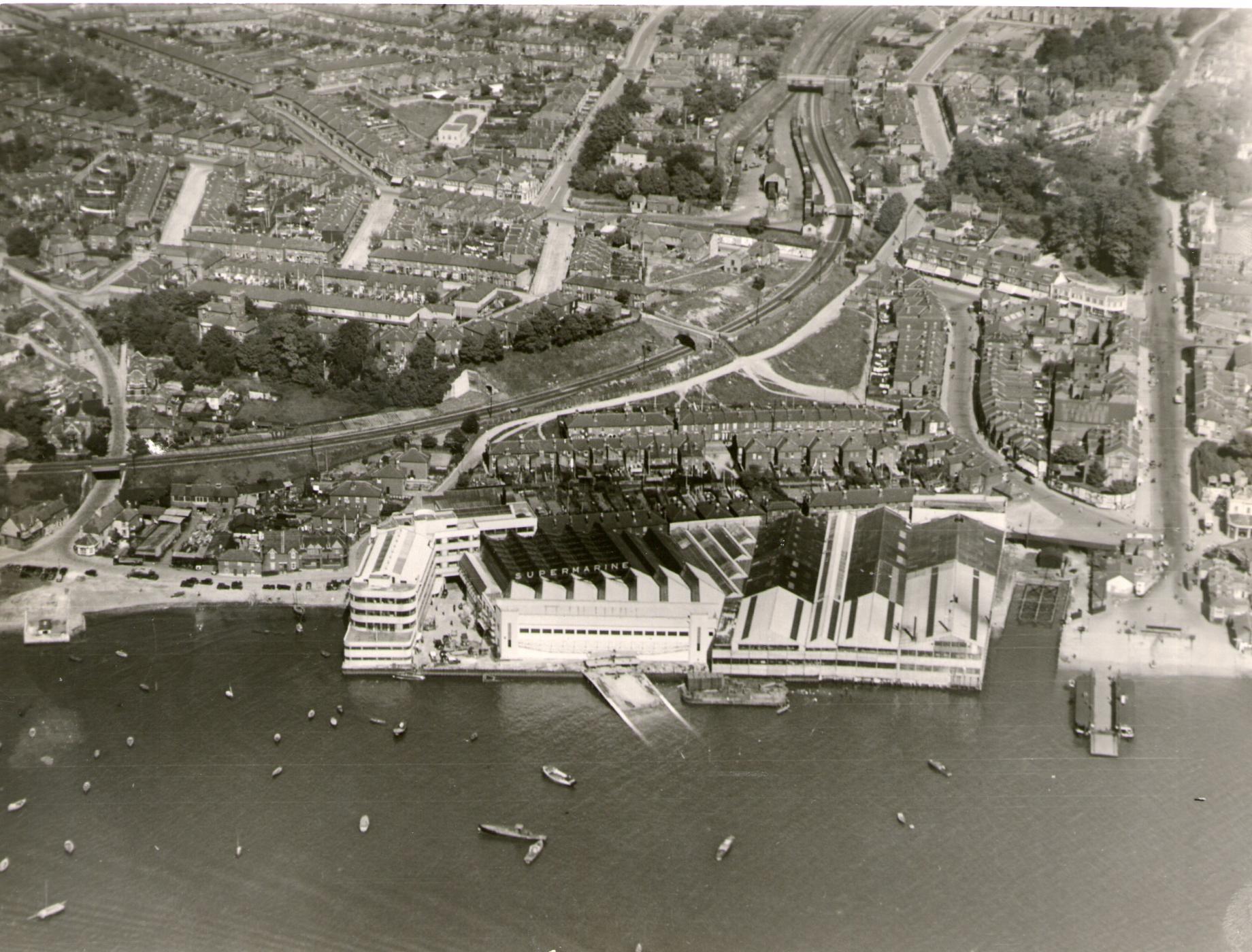
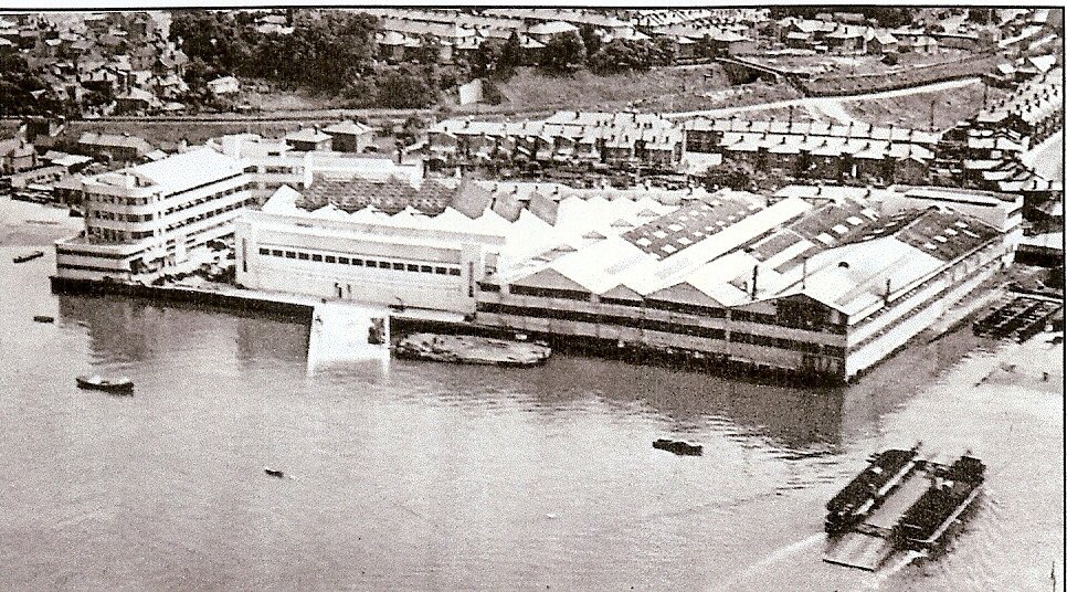
I emailed David and asked him if he had any photos or diagrams of the factory. When it was bombed there was very little left of the main factory (see below). The main office building was the only building left standing until Some years later when it was demolished to make way for a business park, which now sits half vacant. The only thing that is currently left is the large concrete foundations, but even these have been edited to build a bridge over the river that the factory was located alongside. This meant that it was really difficult to find any good quality photos.
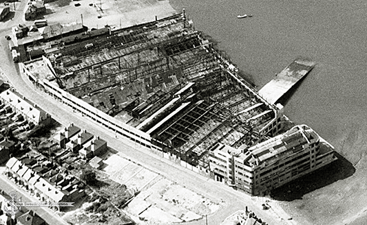
David was able to send me a few photos, mainly of the interior. I am unable to share these as he asked me to keep them private as a few are not in the public realm. I also found a few photos on Google. Every photo that I have found or have been given is in black-and-white. This is useful as it means I can see contrasts, but really unhelpful as I have no idea what colour the building actually was.
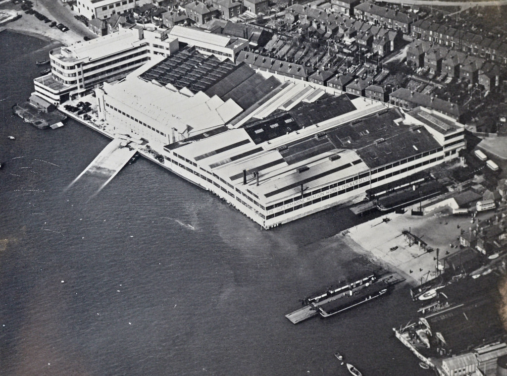
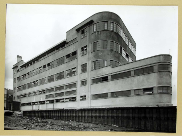
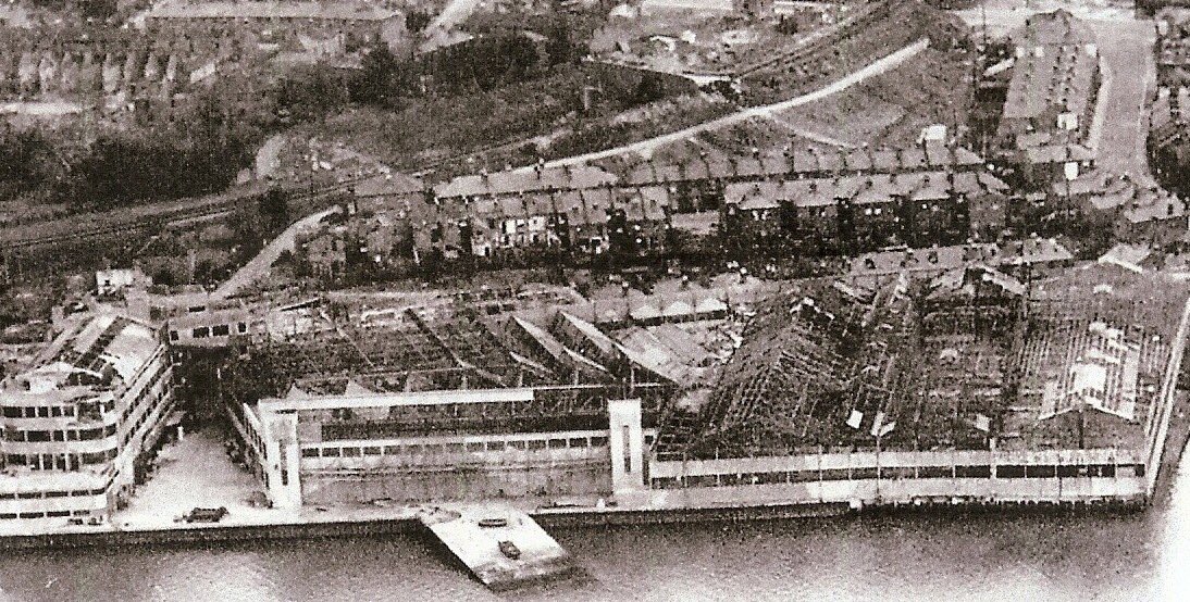
I ended up making a kind of collage of a selection of the most useful images using a pin board. This allowed me to try to figure out what images were of what parts of the building. A lot of the images I managed to collect were difficult to figure out. As the building had a lovely art deco-esque style with curves and thick lines it was difficult to see whether the photo was of one part of the office building another.

As you can see on my pinboard collage, I ended up making some links between photos. For instance originally I had no idea that there were two office buildings. A large main office building on the left and the smaller office building on the back right. I also found out that there were two different car entry parts, one in each of the office buildings, and a bridge stretching across Hazel Road (the road that the Supermarine factory was located on). I also used the printed out images whilst I was creating the factory as it was easier to sift through the pictures by hand rather than on the computer.
Drawings
To begin to get my head around the whole project I ended up doing a few sketches before transferring onto the computer. Below are two that I did right at the start before I began modelling.

Fusion 360
I end up deciding to use fusion 360 to make my model. I could have used Revit or 3DX max But I know how to use fusion the best as I’ve used in the past few projects. Also, as parts of the building are quite fluid I felt that manipulating angles would be easier and more effective in fusion 360.As with all my projects, it’s become second nature to record them. So not to stray from this I have recorded almost all of the building process. Of course there are a few bits missing from when I may have forgotten to start the recorder or accidentally deleted them but 99% of the project build is below.
I’ve had to separate the process into three different videos due to the length of the process. I had recorded over 16 hours of work. This was way too much to put into one video, so I put into three. All of the footage has been sped up by 800% to make it into a time-lapse.
I tried out a new screen recorder for this and unfortunately for some of the videos item windows and layer windows have vanished and you can’t see them. So if you notice my mouse in the video waving up and down, I was most likely using a menu.
I have attempted to put timestamps below the videos to explain a little bit about what I’m doing.
Below is the first video which shows the process of building the main office.
Part 1
00:00 - I started by taking a screenshot of the concrete foundations that still remain from google maps. This allowed me to get a rough shape of the base and curve for the road.
00:56 - Using the concrete foundation outline, I roughly outlined the buildings to give myself a guide of where to proceed.
1:15 - To figure out the dimensions and scale of the buildings, I elected to create the concrete base first to give myself something to go off of. Looking back, I should have moved the base down so that its top was along the X axis to make my life easier further on. This is a mistake I can learn from.
1:20 - I then used the building outlines I made previously to begin to create the main office building.
2:49 - Due to the shape of the building I attempted to enlarge the original outlines to create the layered effect. Unfortunately this didn't work out so well. It meant that the lines around the interior shape were uneven and the windows would be different depths. To get around this, I ended up drawing a bigger shape to ensure everything is even.
4:07 - To create the different floors I decided to extrude the larger shape and copy it upwards to create the floors. At this point I didn't know how to use the ‘Press-Pull’ tool, so I ended up extruding on top of the previous shapes to make them larger. This causes me issues later on.
5:00 - At this point I decided to choose the base colours. As I mentioned previously I don't know the official colours of the building, so I went with simple and contrasting black windows and white walls. The same as what it looks to be in the images. I also used matt black for the garage entrance and later the tunnel to create depth. As I was unable to find out what the interior looked like as well, this seemed like the best option.
5:33 - I then began to create the second upper section of the office in the same tried and tested way as before. One large shape over a smaller shape to create the floors.
10:00 - One the building was beginning to take shape I realised it looked out of proportion and too stumpy. So to correct this I used the ‘Press-Pull’ tool, which I had only just discovered, to pull the building backwards to create the correct proportional length.
11:20 - All around the building there are small windows. To create these in the most concise way, I extruded small squares into poles long enough to go across the window to create smaller windows. This worked quite nicely so I decided to do it for the front of both the bottom and the top halves of the building.
11:58 - The building has a hole-in-the-wall kind of tunnel Where cars would cross underneath the building and into the car park near the dock. I made this in the same way as I made the parking garage, extruding a square through the wall. I also made at the same lack as I mentioned before to create depth.
13:00 - The roof and the offset balcony both had a kind of lipped design. I created this in a similar way as I created the tunnel in the garage. I created a shape as a sketch and extruded it through the part I wanted to cut to create shape. As you can see I had a try a few different times as I could get it right but in the end it looked pretty accurate.
14:20 - The entire office roof has multiple different window boxes and buildings. I didn’t realise until later in the process (not in this video) that the triangular section on the main office building was actually peaked similar to a house roof, this was later adjusted.
17:15 - At this point I decided to use a slightly better recording software but unfortunately I didn’t realise until creating the video that it didn’t record any of the tabs or windows within fusion 360.
19:20 - The office building is an L shape. I drew this out in my original outline, but ended up forgetting as I got into building the first section. This meant I had to try and figure out how to extend the first section of the building to create the L-shaped. This was more trouble than it seems as I can get the joint thickness correct. After a bit of experimenting and a lot of use of the press-pull tool it looks about right.
24:18 - I only have one image that shows the back side of the office where you can see the car tunnel through the building but you can also see a half-circle section going up the wall and abridge across the road. I elected not to create the bridge as I have no images of the building next to, but I tried to create the half-circle section. I hadn’t really worked with circles before this which made it quite difficult to get the size incorrect.
26:30 - As I had created the second half of the building I needed to create the rest of the additional building blocks on the roof which I did in the same way with the extrude tool.
29:35 - I attempted to use the sketch tool and the extruded tool to create details on the roof. This was more difficult than it seemed an identity considering the roof is on an angle. It didn’t go as planned but was a good thing to experiment on.
Part 2
00:35 - To begin I outlined the hangar building extruded upwards to get the height correct before proceeding. The height is one of the things that I don’t want to have to go back and edit as a lot of proportions rely on height being correct.
2:00 - Before moving on any further, I went back and edited a few little details on the office building I made previously. I’m very much a person that will do one thing and then flicked to another before finishing. By going back and doing a few little bits meant that I would focus on the main rubber hand.
2:40 - One of the most important parts of the hanger is the front door. As the hanger was built only a few years before it was bombed, there are few photos that are usable to model from. For instance, in some photos there is a visible decoration on the front of the building but in others it is nowhere to be seen. I didn’t include it as there was little to go by.
5:15 - I realised that I had built the office building roof incorrectly. I had built a single peak where it was actually a triangular shape.
7:02 - To make the model a little more accurate I brought back the satellite image to use as a reference against the main concrete slab. The unfortunate thing about the satellite image is that since the building was demolished such a long time ago and there has been some building work done on top of it is slightly inaccurate.
7:45 - The next main building to create was the main factory building. So now with my adjusted concrete slab I was able to trace out the outline as before of the factory building. When I should have the body up arise proportions were quite correct and had to adjust both the hangar and the factory building. The hangar was easy to correct as I just use the press-pull tool to enlarge the back. The factory running was more difficult as it decided to stretch each separate section rather than all as one single section. To get around this I redrew the shape at the correct size and extruded it back up to where the previous building had been.
10:00 - I created windows on the Front of the hangar by drawing squares and copying them across so that they were equally apart. I used the scale to align tool to make sure that the windows fitted in the space provided. Once the sketch was complete, extruded backwards into the wall and cut a square.
11:55 - I created the windows on the factory building similarly to the windows on the front of the hangar. I drew squares, copied them And then extruded backwards to cut into the building. After colouring the windows it was clear what they were.
13:20 - This is where I began to create the factory roof. Factory roof was a lot easier to create than the hangar roof as the photo evidence that I have available shows the peaks really clearly. The only slightly difficult part was the far right peak as it’s not even, one side is slightly longer than the other. The roof was created fairly easily by drawing out triangles and then extruding them backwards.
14:46 - I made sure to overlap the roof from the building so that I could draw a ring around the outside and extrude up was to cut through the overhanging roof which made the edges flush. If I had attempted to pull the roof in such a way that it was equal, it would have been more likely to leave bumps.
15:10 - At this point I realised that The square that I’d left in the back right of the factory for the office building was too small. To correct this I simply use the press portal to push the walls backwards and enlarge the space.
Unfortunately with the next video I made a few mistakes for editing that I can no longer change. A few of the clips towards the end are in the wrong order, but I have written a note of the time when the clips began to be in the wrong order.
Part 3
0:49 - When I was creating the roof of the hanger I came into a bit of a dilemma. From looking at the images you can’t tell how the roof is formed. To combat this I ended up doing three things. The first was that I printed the best quality image I could find of the roof and drew on it in pen to mark out where I believed the roof was. The second was to put this image into CAD and trace the lines to create a clearer version. And the third was to hand draw the roof from a birds eye view. All of this really helped in creating the roof. Although as you can see in the video, the roof isn’t quite perfect but it’s the best that I could make in a bad situation. Everything I have just written about is below the time stamps.
1:33 - When creating the small roof peaks, the hardest part was getting the correct angle. If the angle was too shallow the roofs but stretch too far along the building. If the angle was too large then they would stretch too far into the centre. The angle I chose wasn’t perfect, but without proper references is the best I could do.
2:35 - After drawing out the roof, I came up with an action plan. I drew out the roof shapes and copied them along, gradually sinking them further into the building to make it seem that they were getting smaller. Once I had seven shapes, accurate to the photos, I squished them slightly closer together so that they fit onto the building comfortably.
4:08 - I couldn’t figure out how to join the two sections of the angled roof successfully. I try to draw a shape and eschewed upwards to bridge the gap, but this didn’t work. I ended up using the loft tool further along To join one face to another
8:18 - An easy way to make sure that part of the roof within the correct place was by making the small roof on the left-hand side of the building. This small peach roof couldn’t be made incorrectly as it is so simple and straight. This little roof was a good way to align the rest of the roofing.
9:00 - The second half of the hangar roof is a lot easier as each section was straight. All I had to do was outline the end part of the front roof and extrude backwards.
10:10 - Due to the angles being slightly incorrect I ended up having to cut the section of the back part of the roof for it to fit. In all my images it is easy to tell that the small triangular roofs are whole, but for all I know the large straight pieces of roof may have cut outs.
14:15 - I created the windows on the side of the factory in the same way that I created the windows on the front and the side of the hangar. Drawing outgrows, copying them and then extruding backwards to cut through the wall. Later on in the process I do have an issue where the colours of the windows as. I later found out this was because I had accidentally extruded the windows forward which had covered up the paint below. This was an easy fix is all I had to do was move the window backing to where previously was.
17:39 - The final building to create was the small office building. Unfortunately aside from the aerial photos I only have one image of this building, so a lot of what I did this building was guesswork. It keeps with the theme having the layered windows and the curves and that all that matters.
18:31 - Once the small office building was initially built I realise that it was very much out of proportion. To fix this extruded back was the factory and extruded forwards the office building into its place.
20:10 - I created the smaller details along the office building by extruding small squares to create bars on that of the balcony and decorations across the walls.
20:58 - This was when I began to get into the details. I started on the roof windows along the factory. Whereas previously isolated each section and created them one by one, this one I created all in one sketch. This made everything a lot more consistent.
23:40 - At this point I created the ramp. The ramp is an original feature which still exists today so it’s a must have for the model. It was a little bit tricky to create as it is an angle going upwards as well as horizontally but I just use the same cutting technique to cut off the top to make sure that it will join incorrectly.
25:57 - This is the point where the video clips start to be out of order.
30:06 - As the factory basics the water I wanted to learn how to create a river beside my model. I had to use tools I’ve never used in fusion before to do this. I have used similar tools on CAD, but they work differently in fusion. I created a form, a completely new technique. Originally when I started to do this I put way too many squares into the form and the programme would attempt to crash. Once I lowered the amount to 25 it worked pretty well and fusion didn’t crash. I then had to select random squares and move them up or down to make a wavelike design. The only issue I found with this after I figured it out was that the water texture looks very shiny and doesn’t work very well alongside the white building.
34:48 - Before I could render I needed to create the most important part of the entire building the super marine text. I made it quite simply in that I brought in some text that I designed on Adobe Illustrator and then traced around the text. This was slightly tricky to get some of the curved correct but in the end I think it looks pretty good. After I had drawn the outlines, I extruded them and moved the full shapes into position. I then created what seemed like metal bars to hold up the letters as in real life they would not be floating.
Roof drawings
Below are the roof drawings that I spoke about earlier.Final product
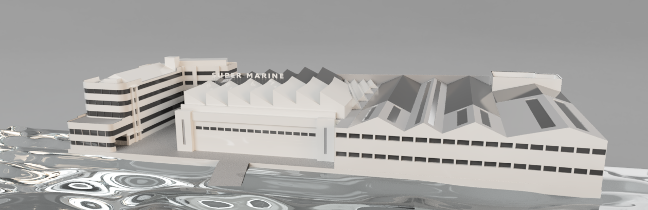
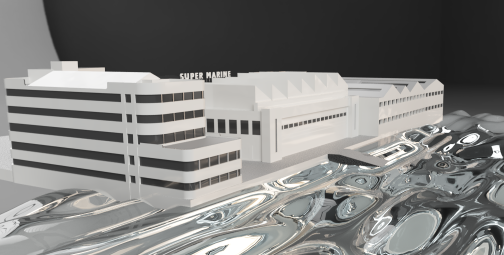
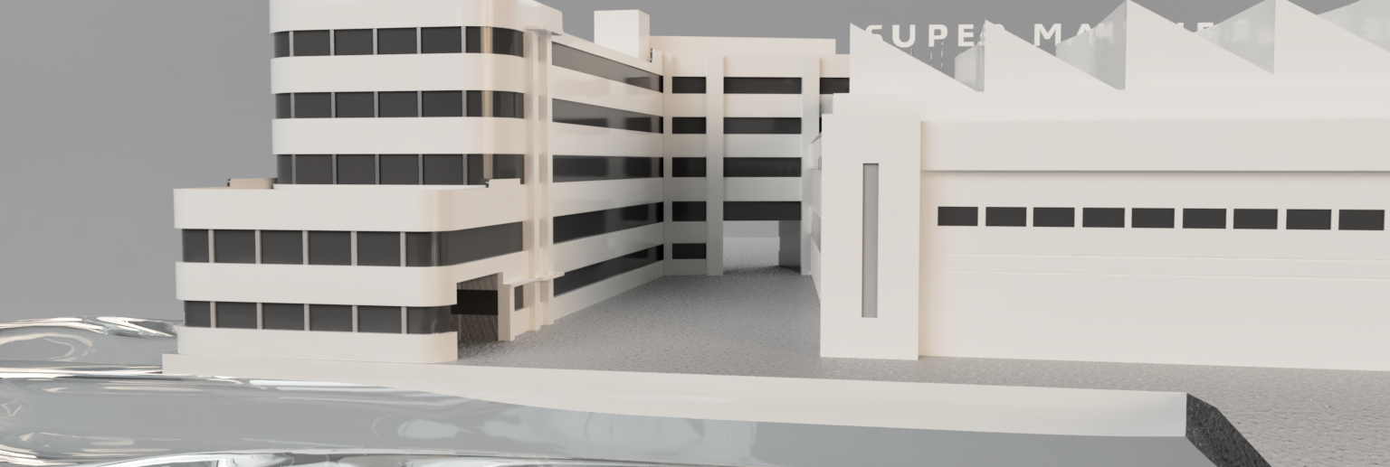
All in all I’m really proud of what I’ve created. From watching the footage of the time lapses you can really see how I started off a little unsure but throughout the process gained confidence using Fusion. I’m wanting to continue on the model and attempts to hone in on some of the details are a lot more difficult due to lack of source material. I can’t wait to see what my model looks like alongside the Spitfire models.I also would like to create the inside. As I mentioned before when we spoke to Katie and David they really stress for us to try our hardest but not to push ourselves. To make a good product rather than a lot of not so good products. That’s what I did with this. I made a good factory but I’m proud of rather than making a partially completed factory and a partially completed interior. The interior of this building from what I’ve seen photos used to be beautiful. It had sweeping staircases and an art deco kind of style. Even if I don’t recreate this for the project, I might just create it my own enjoyment.
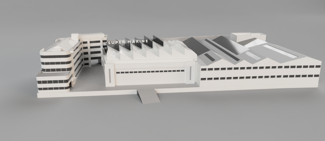
Below are a few renders of my factory model.
Brand Guidelines
Unfortunately, since we will put into quarantine my group hasn't been able to get in contact with the designers in the group. A requirement on the module handbook is to have a brand guidelines document but as we don’t have any other branding we had to create our own version. So, instead of a brand guidelines document we have got a ‘3D Website components and animation’ document. It shows the models we have created and a mockup of how they would look. We put them all together, which unfortunately we were unable to do. The document is below.Transmedia 2020
Brief
Last semester my group and I began to design the branding for the Transmedia 2020 exhibition. This semester the entire year 2 Digital Media cohort needed to organise the exhibition ready for its April date. Unfortunately since the beginning of this year the world has quite literally turned upside down. Due to Coronavirus the exhibition has to be postponed until the beginning of year 3, but nevertheless planning has gone on and will continue to go on until the exhibition finally happens.Role
The roles for organising Transmedia were sorted out during a lecture. I had a moment of bravery during this lecture and agreed to two different roles! I put myself forward for organising the time table and layout of the exhibition as well as being one of the overall project managers.Project manager
I am one of 4 project managers. We split up all of the different jobs between the four of us. I am organising the layout, which I am also creating, as well as the equipment. For the equipment I have been liaising with Buster and the team who speak to the first years to get any equipment requests. Currently I have 3 groups of requests ready to hand off to the equipment team.My Role will really start to pick up again nearer the time as we begin to make sure everything is inline before the exhibition, but for now it has slowed down.
Layout
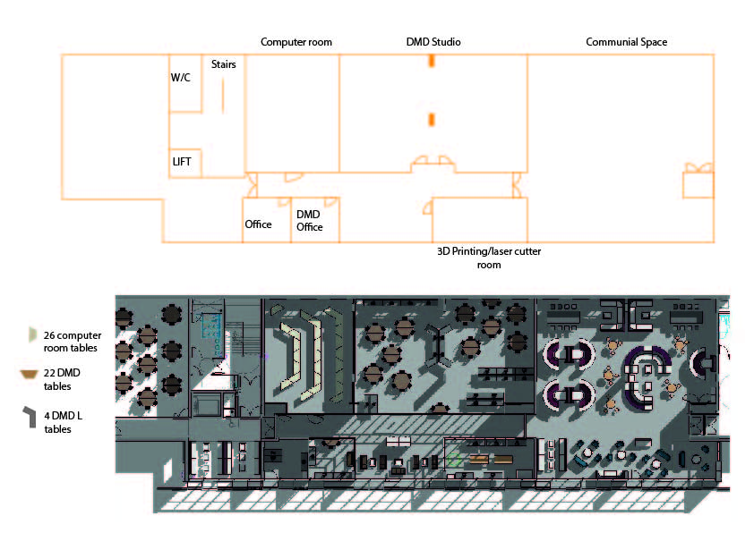
The other task that I set myself up for was to organise the layout and the time schedule. I was one of three in the group and the only one who does CAD.The exhibition is taking place in the new building that is currently being built. Originally there was a lot of unsureness whether or not the exhibition would take place in the new building due to the build not being finished yet. On the bright side, since the exhibition has now had to be postponed we will definitely be having it in the new building.
Debs was really helpful and provided us with the floor plan on Revit. I used the floor plan that Debs gave us to figure out where to put the tables. As I was the only one in the group with the ability to use Autodesk products I created an outline version of the plan on CAD and transferred into Illustrator so that the other members of the group could play around with the layout as well. Below is the CAD version of the Revit document.
Here is the document I sent to the other members of my group to play around with. The finished example is the first version I made.
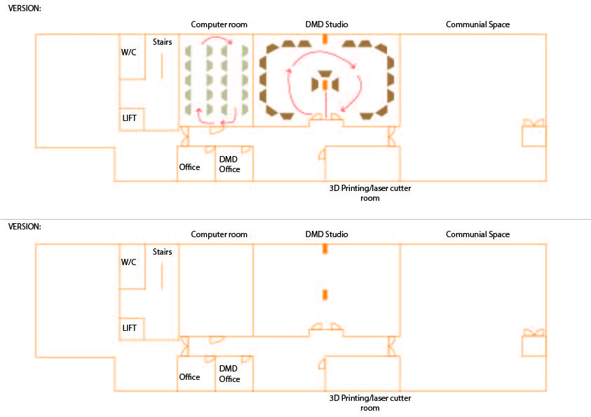
The layout isn’t 100% decided on yet as when I got to visit the building plans changed slightly. I was lucky enough to visit the new building on two different occasions. This was really helpful as you can’t always visualise how large a space is until you’ve actually visited it. We also found out that one of the rooms that we thought we’d be able to use, you can’t actually move the tables in. So the layout is still in the works.
Below is a little overview video I took of the space during my first visit.